
This is a Pure Css3 navigation bar. Im gonna explain how to add it to blogger.Pure Css3 navigation menu work fine with every modern internet browsers.You can link with your main pages by using wire frame navigation. Just check out demo. Its easy to add to blogger.

You may like these articles.
Css3 Thin Style Navigation
Simple Rounded Corner Css Navigation
Css3 Navigation Bar With Google Custom Search
1. Log in to blogger account and Click drop down.
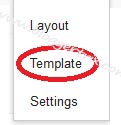
 2. Now select "Template" Like Below.
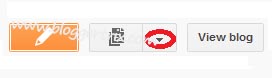
3. Now you can see Live on blog, Click EDIT HTML Button"
4. Find this tag by using Ctrl+F ]]></b:skin>
5. Paste below code Before ]]></b:skin> tag
6. Go to blogger and click Layout
7. Click Add Gadget and select 'HTML/Javascript
8. Paste below code.
9. Now save your HTML/Javascript'.You are done.
Hope this Pure CSS3 Menu Bar helpful to you all.

You may like these articles.
Css3 Thin Style Navigation
Simple Rounded Corner Css Navigation
Css3 Navigation Bar With Google Custom Search
How to add Pure CSS3 Menu Bar for Blogger
1. Log in to blogger account and Click drop down.
3. Now you can see Live on blog, Click EDIT HTML Button"
4. Find this tag by using Ctrl+F ]]></b:skin>
5. Paste below code Before ]]></b:skin> tag
/* The CSS Code for the menu starts here bloggertrix.com */
ul.btrix_cssTabs   {

 background: #848383;
 border:solid 1px #606060;
 padding: 0 75px;
 width: 705px;
 margin:20px 0;
 font-size:12px;
 font-weight:bold;
 background:-moz-linear-gradient(0% 100% 90deg,#737373, #9a9a9a);
 background:-webkit-gradient(linear, 0% 0%, 0% 100%, from(#9a9a9a), to(#737373));
  box-shadow: inset 0 1px 0 0 #dfdfdf;
 -moz-box-shadow: inset 0 1px 0 0 #dfdfdf;
 -webkit-box-shadow: inset 0 1px 0 0 #dfdfdf;
 border-radius: 8px 8px;
 -moz-border-radius: 8px 8px;
 -webkit-border-radius: 8px 8px;

}
ul.btrix_cssTabs > li {
 background:#989898;
 color:#3a3a3a;
 border:solid 1px #606060;
 border-bottom:0;
 display: inline-block;
 margin: 10px 1px -1px;
 padding: 8px 20px;
 background:-moz-linear-gradient(0% 100% 90deg,#9a9a9a, #888888);
 background:-webkit-gradient(linear, 0% 0%, 0% 100%, from(#888888), to(#9a9a9a));
 box-shadow: inset 0 1px 0 0 #dfdfdf;
 -moz-box-shadow: inset 0 1px 0 0 #dfdfdf;
 -webkit-box-shadow: inset 0 1px 0 0 #dfdfdf;

 text-shadow: 1px 1px 0 #d3d3d3;
}

ul.btrix_cssTabs > li.active,ul.btrix_cssTabs > li:hover {
 background:#ededed;
 background:-moz-linear-gradient(0% 100% 90deg,#f0f0f0, #d1d1d1) !important;
 background:-webkit-gradient(linear, 0% 0%, 0% 100%, from(#d1d1d1), to(#f0f0f0)) !important;
 box-shadow: inset 0 1px 0 0 #fff;
 -moz-box-shadow: inset 0 1px 0 0 #fff;
 -webkit-box-shadow: inset 0 1px 0 0 #fff;
 text-shadow: none;
 cursor:pointer;
}

ul.btrix_cssTabs.blue{

 background: #237e9f;
 border-color:#20617f;
 background:-moz-linear-gradient(0% 100% 90deg,#217092, #2d97b8);
 background:-webkit-gradient(linear, 0% 0%, 0% 100%, from(#2d97b8), to(#217092));
 box-shadow: inset 0 1px 0 0 #a8e3f0;
 -moz-box-shadow: inset 0 1px 0 0 #a8e3f0;
 -webkit-box-shadow: inset 0 1px 0 0 #a8e3f0;

}
ul.btrix_cssTabs.blue > li,ul.btrix_cssTabs.blue > li:hover {
 background:#2ca0c1;
 color:#1a4760;
 border-color:#20617f;
 background:-moz-linear-gradient(0% 100% 90deg,#2ca1c3, #2687aa);
 background:-webkit-gradient(linear, 0% 0%, 0% 100%, from(#2687aa), to(#2ca1c3));
box-shadow: inset 0 1px 0 0 #a8e3f0;
 -moz-box-shadow: inset 0 1px 0 0 #a8e3f0;
 -webkit-box-shadow: inset 0 1px 0 0 #a8e3f0;
text-shadow: 1px 1px 0 #8cd9e8;

}

ul.btrix_cssTabs.blue > li.active {
  box-shadow: inset 0 1px 0 0 #fff;
 -moz-box-shadow: inset 0 1px 0 0 #fff;
 -webkit-box-shadow: inset 0 1px 0 0 #fff;
 text-shadow: none;
}

ul.btrix_cssTabs.orange{

 background: #d75125;
 border-color:#9c2c09;
background:-moz-linear-gradient(0% 100% 90deg,#d44b22, #ea753d);
 background:-webkit-gradient(linear, 0% 0%, 0% 100%, from(#ea753d), to(#d44b22));
 box-shadow: inset 0 1px 0 0 #f5b497;
 -moz-box-shadow: inset 0 1px 0 0 #f5b497;
 -webkit-box-shadow: inset 0 1px 0 0 #f5b497;

}
ul.btrix_cssTabs.orange > li, ul.btrix_cssTabs.orange > li:hover {
 background:#e1693e;
 color:#5a2818;
 border-color:#9c2c09;
 background:-moz-linear-gradient(0% 100% 90deg,#e47a48, #dd5733);
 background:-webkit-gradient(linear, 0% 0%, 0% 100%, from(#dd5733), to(#e47a48));
box-shadow: inset 0 1px 0 0 #f5b497;
 -moz-box-shadow: inset 0 1px 0 0 #f5b497;
 -webkit-box-shadow: inset 0 1px 0 0 #f5b497;
text-shadow: 1px 1px 0 #f3c6b3;

}
ul.btrix_cssTabs.orange > li.active {
 box-shadow: inset 0 1px 0 0 #fff;
 -moz-box-shadow: inset 0 1px 0 0 #fff;
 -webkit-box-shadow: inset 0 1px 0 0 #fff;
 text-shadow: none;
}
6. Go to blogger and click Layout
7. Click Add Gadget and select 'HTML/Javascript
8. Paste below code.
<ul class="btrix_cssTabs">
 <li class="active" ><a href='#'>Home</a></li>
 <li><a href='#'>Points</a></li>
 <li><a href='#'>Percent</a></li>
 <li><a href='#'>Contact Us</a></li>
</ul>

<ul class="btrix_cssTabs blue">
 <li><a href='#'>Home</a></li>
 <li class="active"><a href='#'>Points</a></li>
 <li><a href='#'>Percent</a></li>
 <li><a href='#'>iContact Us</a></li>
</ul>
<ul class="btrix_cssTabs orange">
 <li><a href='#'>Home</a></li>
 <li><a href='#'>Points</a></li>
 <li class="active "><a href='#'>Percent</a></li>
 <li><a href='#'>Contact Us</a></li>
</ul>
Replace # with your links.
9. Now save your HTML/Javascript'.You are done.
Hope this Pure CSS3 Menu Bar helpful to you all.


very good. i love it. and would love more if it would have been round corner.
ReplyDeleteThanks for comment. I will publish a new tutorial with round corner navigation.Please keep visiting. have a great day.
DeleteThis is helpful and the installation process is easy. Thanks for this post!
ReplyDeleteThe above comment has been shared by Sunday - Kingged.com contributor in
http://www.kingged.com/attractive-pure-css3-menu-bar-blogger/
Thank you very much for sharing this information. I like this side. Its really a great article. So please give me some important information about this side.
ReplyDeleteThanks for your comment friend. Keep visiting bloggertrix.com
Deleteyo will get more great articles.