Showing posts with label Buttons. Show all posts

Thursday, February 11, 2016

CSS3 Button Collection With Different Hover Effects

File Under: , , 22 comments

Awesome Css3 button collection for your  blog.


Check all buttons from bloggertrix.com

CSS3 buttons collection


CSS3 BUtton Hover Effects COllaection

1. Go to Blogger Dashboard > Template
2. Find ]]></b:skin>
3. Paste below code just below it.


/*== Button hover css ==*/
button{border: 0; font-family: "Open Sans"; font-weight: 600; padding: 8px 12px; width: 120px; color: #fff; border-radius: 5px; background-color: #DB733B; cursor: pointer; position: relative; z-index: 1;}
.b1:before{content: ""; width: 100%; height: 0; position: absolute; background-color: #3395D0; left: 0; bottom: 0; transition:.4s; z-index: -1;}
.b1:hover:before{height: 100%; bottom: auto; top: 0;}

.b2:before{content: ""; width: 100%; height: 0; position: absolute; background-color: #3395D0; left: 0; top: 0; transition:.4s; z-index: -1;}
.b2:hover:before{height: 100%; top: auto; bottom: 0;}

.b3:before{content: ""; width: 0; height: 100%; position: absolute; background-color: #3395D0; right: 0; top: 0; transition:.4s; z-index: -1;}
.b3:hover:before{width: 100%; right: auto; left: 0;}

.b4:before{content: ""; width: 0; height: 100%; position: absolute; background-color: #3395D0; left: 0; top: 0; transition:.4s; z-index: -1;}
.b4:hover:before{width: 100%; left: auto; right: 0;}

.b5:before{content: ""; width: 0; height: 0; position: absolute; background-color: #3395D0; right: 0; bottom: 0; transition:.4s; z-index: -1;}
.b5:hover:before{width: 100%; height: 100%; right: auto; left: 0; bottom: auto; top: 0;}

.b6:before{content: ""; width: 0; height: 0; position: absolute; background-color: #3395D0; left: 0; top: 0; transition:.4s; z-index: -1;}
.b6:hover:before{width: 100%; height: 100%; left: auto; right: 0; top: auto; bottom: 0;}

.b7:before{content: ""; width: 0; height: 0; position: absolute; background-color: #3395D0; left: 50%; bottom: 50%; transition:.4s; z-index: -1;}
.b7:hover:before{width: 100%; height: 100%; left: 0; bottom: 0;}

.b8:before{content: ""; width: 0; height: 100%; position: absolute; background-color: #3395D0; left: 0; top: 0; transition:.4s; z-index: -1;}
.b8:after{content: ""; width: 0; height: 100%; position: absolute; background-color: #3395D0; right: 0; top: 0; transition:.4s; z-index: -1;}
.b8:hover:before, .b8:hover:after{width: 50%;}

.b9:before{content: ""; width: 0; height: 100%; position: absolute; background-color: #3395D0; left: 50%; top: 0; transition:.3s; z-index: -1;}
.b9:after{content: ""; width: 0; height: 100%; position: absolute; background-color: #3395D0; right: 50%; top: 0; transition:.3s; z-index: -1;}
.b9:hover:before, .b9:hover:after{width: 50%;}
.b9:hover:before{left: 0;}
.b9:hover:after{right: 0;}

.b10:before{content: ""; width: 0; height: 0; position: absolute; background-color: #3395D0; left: 0; top: 0; transition:.4s; z-index: -1;}
.b10:after{content: ""; width: 0; height: 0; position: absolute; background-color: #3395D0; right: 0; bottom: 0; transition:.4s; z-index: -1;}
.b10:hover:before, .b10:hover:after{width: 50%; height: 100%;}

.b11:before{content: ""; width: 0; height: 0; position: absolute; background-color: #3395D0; left: 0; bottom: 0; transition:.4s; z-index: -1;}
.b11:after{content: ""; width: 0; height: 0; position: absolute; background-color: #3395D0; right: 0; top: 0; transition:.4s; z-index: -1;}
.b11:hover:before, .b11:hover:after{width: 50%; height: 100%;}

.b12:before{content: ""; width: 100%; height: 0; position: absolute; background-color: #3395D0; left: 0; bottom: 0; transition:.4s; z-index: -1;}
.b12:after{content: ""; width: 100%; height: 0; position: absolute; background-color: #3395D0; right: 0; top: 0; transition:.4s; z-index: -1;}
.b12:hover:before, .b12:hover:after{height: 50%;}

.b13:before{content: ""; width: 100%; height: 0; position: absolute; background-color: #3395D0; left: 0; bottom: 50%; transition:.3s; z-index: -1;}
.b13:after{content: ""; width: 100%; height: 0; position: absolute; background-color: #3395D0; right: 0; top: 50%; transition:.3s; z-index: -1;}
.b13:hover:before, .b13:hover:after{height: 50%;}
.b13:hover:before{bottom: 0;}
.b13:hover:after{top: 0;}

/*= button hover with text =*/
.withText button{height: 39px; overflow: hidden;}
button span{display: block; position: relative; transition:.35s;}

.bt1 .after{top: -45px;}
.bt1 .before{top: 0;}
.bt1:hover .before{top: 45px;}
.bt1:hover .after{top: -18px;}
.bt1:before{content: ""; width: 100%; height: 0; position: absolute; background-color: #3395D0; left: 0; top: 0; transition:.4s; z-index: -1;}
.bt1:hover:before{height: 100%;}

.bt2 .after{bottom: -10px;}
.bt2 .before{bottom: 0;}
.bt2:hover .before{bottom: 45px;}
.bt2:hover .after{bottom: 18px;}
.bt2:before{content: ""; width: 100%; height: 0; position: absolute; background-color: #3395D0; left: 0; bottom: 0; transition:.4s; z-index: -1;}
.bt2:hover:before{height: 100%;}

.bt3 .after{left: -90px; top: -18px;}
.bt3 .before{right: 0;}
.bt3:hover .before{right: -90px;}
.bt3:hover .after{left: 0;}
.bt3:before{content: ""; width: 0; height: 100%; position: absolute; background-color: #3395D0; left: 0; bottom: 0; transition:.4s; z-index: -1;}
.bt3:hover:before{width: 100%;}

.bt4 .after{right: -90px; top: -18px;}
.bt4 .before{left: 0;}
.bt4:hover .before{left: -90px;}
.bt4:hover .after{right: 0;}
.bt4:before{content: ""; width: 0; height: 100%; position: absolute; background-color: #3395D0; right: 0; bottom: 0; transition:.4s; z-index: -1;}
.bt4:hover:before{width: 100%;}

.bt5 .after{top: -45px; z-index: 9;}
.bt5 .before{top: 0;}
.bt5:hover .before{top: -45px;}
.bt5:hover .after{top: -18px;}
.bt5:before{content: ""; width: 100%; height: 0; position: absolute; background-color: #3395D0; left: 0; top: 0; transition:.4s; z-index: 1;}
.bt5:hover:before{height: 100%;}

.bt6 .after{bottom: -10px; z-index: 9;}
.bt6 .before{bottom: 0;}
.bt6:hover .before{bottom: -45px;}
.bt6:hover .after{bottom: 18px;}
.bt6:before{content: ""; width: 100%; height: 0; position: absolute; background-color: #3395D0; left: 0; bottom: 0; transition:.4s; z-index: 1;}
.bt6:hover:before{height: 100%;}

.bt7 .after{left: -90px; top: -18px; z-index: 9;}
.bt7 .before{right: 0;}
.bt7:hover .before{right: 90px;}
.bt7:hover .after{left: 0;}
.bt7:before{content: ""; width: 0; height: 100%; position: absolute; background-color: #3395D0; left: 0; bottom: 0; transition:.4s; z-index: 1;}
.bt7:hover:before{width: 100%;}

.bt8 .after{right: -90px; top: -18px; z-index: 9;}
.bt8 .before{left: 0;}
.bt8:hover .before{left: 90px;}
.bt8:hover .after{right: 0;}
.bt8:before{content: ""; width: 0; height: 100%; position: absolute; background-color: #3395D0; right: 0; bottom: 0; transition:.4s; z-index: 1;}
.bt8:hover:before{width: 100%;}

.bt9 .after{top: -45px;}
.bt9 .before{top: 0;}
.bt9:hover .before{top: 45px;}
.bt9:hover .after{top: -18px;}
.bt9:hover{background-color: #3395D0; transition:.4s;}

.bt10 .after{bottom: -10px;}
.bt10 .before{bottom: 0;}
.bt10:hover .before{bottom: 45px;}
.bt10:hover .after{bottom: 18px;}
.bt10:hover{background-color: #3395D0; transition:.4s;}

.bt11 .after{left: -90px; top: -18px;}
.bt11 .before{right: 0;}
.bt11:hover .before{right: -90px;}
.bt11:hover .after{left: 0;}
.bt11:hover{background-color: #3395D0; transition:.4s;}

.bt12 .after{right: -90px; top: -18px;}
.bt12 .before{left: 0;}
.bt12:hover .before{left: -90px;}
.bt12:hover .after{right: 0;}
.bt12:hover{background-color: #3395D0; transition:.4s;}

.bt13 .after{top: -45px; z-index: 9;}
.bt13 .before{top: 0;}
.bt13:hover .before{top: -45px;}
.bt13:hover .after{top: -18px;}
.bt13:hover{background-color: #3395D0; transition:.4s;}

.bt14 .after{bottom: -10px; z-index: 9;}
.bt14 .before{bottom: 0;}
.bt14:hover .before{bottom: -45px;}
.bt14:hover .after{bottom: 18px;}
.bt14:hover{background-color: #3395D0; transition:.4s;}

.bt15 .after{left: -90px; top: -18px; z-index: 9;}
.bt15 .before{right: 0;}
.bt15:hover .before{right: 90px;}
.bt15:hover .after{left: 0;}
.bt15:hover{background-color: #3395D0; transition:.4s;}

.bt16 .after{right: -90px; top: -18px; z-index: 9;}
.bt16 .before{left: 0;}
.bt16:hover .before{left: 90px;}
.bt16:hover .after{right: 0;}
.bt16:hover{background-color: #3395D0; transition:.4s;}
/*== Button hover css end ==*/
   
4. Now save your  Template  and get HTML Codes from below link

  HTML Codes for every CSS3 buttons

Now get your HTML code from below link for each buttons.
credits: http://tympanus.net/codrops/
Author Bio: Sohan Jayasinghe is the owner and author of Bloggertrix.com .He has been blogging since 2009 and writing Blogger trix since 2010.If you want to contact him, Just leave a message via contact us page or connect with facebook or twitter
Read More

Saturday, February 16, 2013

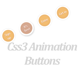
CSS3 Circle Effect Buttons Style For Blogger

File Under: , , , 1 comment

In this post, im explain, how to  add awesome animation   button  to your blog.I'm using CSS and  HTML for this    tutorial.You can   check,   demo   page by   below   link.  This is   easy to add to bloggers. Earlier buttons articles


Demo

1. Log in to blogger account and Click drop down.
blog-post-option
2. Now select "Template" Like Below.

Select-template

3. Now you can see Live on blog, Click EDIT HTML Button"

4. Now click Proceed button.

5.Find this code  by using Ctrl+F  ]]></b:skin>

6.  Paste below code Before ]]></b:skin> code

.a-btn{
    width:60px;
    height:60px;
    -webkit-border-radius:50%;
    -moz-border-radius:50%;
    border-radius:50%;
    display:block;
    margin:20px;
    float:left;
    background:#f0ad4e;
    position:relative;
    -webkit-box-shadow:0px 0px 5px 0px rgba(246, 212, 163, 0.5) inset, 0px -1px 5px 4px rgba(170, 77, 27, 0.2) inset, 0px 0px 0px 7px #fff,  0px 0px 1px 8px rgba(188, 188, 188, 0.4), 0px 0px 0px 9px #fff;
    -moz-box-shadow:0px 0px 5px 0px rgba(246, 212, 163, 0.5) inset, 0px -1px 5px 4px rgba(170, 77, 27, 0.2) inset, 0px 0px 0px 7px #fff,  0px 0px 1px 8px rgba(188, 188, 188, 0.4), 0px 0px 0px 9px #fff;
    box-shadow:0px 0px 5px 0px rgba(246, 212, 163, 0.5) inset, 0px -1px 5px 4px rgba(170, 77, 27, 0.2) inset, 0px 0px 0px 7px #fff,  0px 0px 1px 8px rgba(188, 188, 188, 0.4), 0px 0px 0px 9px #fff;
    -webkit-transition:all 0.3s linear;
    -moz-transition:all 0.3s linear;
    -o-transition:all 0.3s linear;
    transition:all 0.3s linear;
}
.a-btn span{
    display:table-cell;
    width:40px;
    height:40px;
    padding:10px;
    text-align:center;
    vertical-align:middle;
    font-size:16px;
    color:#fff;
    text-shadow:0px 1px 1px #A03F16;
    font-family:"Arvo", "Myriad Pro", "Trebuchet MS", sans-serif;
    -webkit-transition:all 0.3s linear;
    -moz-transition:all 0.3s linear;
    -o-transition:all 0.3s linear;
    transition:all 0.3s linear;
}
.a-btn span:nth-child(1), 
.a-btn span:nth-child(3){
    position:absolute;
    top:0px;
    left:0px;
    font-size:16px;
    line-height:19px;
    opacity:0;
}
.a-btn span:nth-child(1){
    background:transparent url(https://blogger.googleusercontent.com/img/b/R29vZ2xl/AVvXsEhoZx3-Cj8Q8UjZGSGzgZdyJWz9pcL3mAsT2M2wrGJkNUmGn0A0vRSSxeLhNO1-e_gaeKkUBDqNh0EyYtN_Y55J-mIP3FCs888bcMTTCHRC4E0i9YtPvPHmMynVV_Gwt6WjI89eu9MSDfY/s1600/star.png) no-repeat center center;
    opacity:0.2;
}
.a-btn:hover{
    background:rgba(170, 77, 27, 0.6);
    -webkit-box-shadow:0px 0px 5px 0px rgba(246, 212, 163, 0.5) inset, 0px -1px 5px 4px rgba(170, 77, 27, 0.2) inset, 0px 0px 0px 7px #fff,  1px 4px 5px 8px rgba(188, 188, 188, 0.6), 0px 0px 0px 9px #fff;
    -moz-box-shadow:0px 0px 5px 0px rgba(246, 212, 163, 0.5) inset, 0px -1px 5px 4px rgba(170, 77, 27, 0.2) inset, 0px 0px 0px 7px #fff,  1px 4px 5px 8px rgba(188, 188, 188, 0.6), 0px 0px 0px 9px #fff;
    box-shadow:0px 0px 5px 0px rgba(246, 212, 163, 0.5) inset, 0px -1px 5px 4px rgba(170, 77, 27, 0.2) inset, 0px 0px 0px 7px #fff,  1px 4px 5px 8px rgba(188, 188, 188, 0.6), 0px 0px 0px 9px #fff;
}
.a-btn:hover span:nth-child(3){
    opacity:1;
}
.a-btn:hover span:nth-child(2){
    opacity: 0; 
    -webkit-transform: scale(0);
    -moz-transform: scale(0);
    transform: scale(0);
}
.a-btn:hover span:nth-child(1){
    -webkit-animation:rotate 1s linear;
    -moz-animation:rotate 1s linear;
    animation:rotate 1s linear;
}
.a-btn:active{
    -webkit-box-shadow:0px 0px 5px 0px rgba(246, 212, 163, 0.5) inset, 0px -1px 5px 4px rgba(170, 77, 27, 0.2) inset, 0px 0px 0px 7px #fff,  0px -1px 0px 8px rgba(188, 188, 188, 0.3), 0px 0px 0px 10px #fff;
    -moz-box-shadow:0px 0px 5px 0px rgba(246, 212, 163, 0.5) inset, 0px -1px 5px 4px rgba(170, 77, 27, 0.2) inset, 0px 0px 0px 7px #fff,  0px -1px 0px 8px rgba(188, 188, 188, 0.3), 0px 0px 0px 10px #fff;
    box-shadow:0px 0px 5px 0px rgba(246, 212, 163, 0.5) inset, 0px -1px 5px 4px rgba(170, 77, 27, 0.2) inset, 0px 0px 0px 7px #fff,  0px -1px 0px 8px rgba(188, 188, 188, 0.3), 0px 0px 0px 10px #fff;
}
.a-btn:active span:nth-child(2){
    color:rgba(170, 77, 27, 0.8);
    text-shadow:0px 1px 1px rgba(255, 255, 255, 0.6);
}
@keyframes rotate{
    0% { transform: scale(1) rotate(0);}
    50% { transform: scale(0.5) rotate(180deg);}
    100% { transform: scale(1) rotate(360deg);}
}
@-webkit-keyframes rotate{
    0% { -webkit-transform: scale(1) rotate(0);}
    50% { -webkit-transform: scale(0.5) rotate(180deg);}
    100% { -webkit-transform: scale(1) rotate(360deg);}
}
@-moz-keyframes rotate{
    0% { -moz-transform: scale(1) rotate(0);}
    50% { -moz-transform: scale(0.5) rotate(180deg);}
    100% { -moz-transform: scale(1) rotate(360deg);}
}


7. Go to blogger  and click drop-down like  1st step and select Layout

8. Click Add Gadget and select 'HTML/Javascript"

9. Paste below code.

<div class="button-wrapper">

<a href="#" class="a-btn"><span></span>
<span>Sign up</span>
<span>It's free!</span></a>

<a href="#" class="a-btn"><span></span>
<span>Join Now</span>  
<span>It's free!</span></a>

<a href="#" class="a-btn"><span></span>
<span>Enter</span> 
<span>It's free!</span></a>

<a href="#" class="a-btn">
<span></span>
<span>Get in</span>
<span>It's free!</span></a>
</div>

 *Replace Button URL

10. Now save your template. You are done.
Read More

Monday, December 10, 2012

Animated Css3 Blogger Buttons With Nice Image Effect

File Under: , , 6 comments

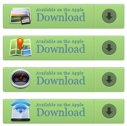
In  this  tutorial im gonna explain how to addnice  Css3 buttons  with  image hover  effect. you can use it for   any buttons.  specially for sale items.you can change image as your like. Im using  Css3 and HTML  for these buttons. Tutorial  You  can check  my  Earlier buttons
articles here


Animated+Css3+Blogger+Buttons+With+Nice+Image+Effect


DEMO

1. Log in to blogger account and Click drop down.
blog-post-option
2. Now select "Template" Like Below.

Select-template

3. Now you can see Live on blog, Click EDIT HTML Button"

4. Now click Proceed button.

5.Find this code  by using Ctrl+F  ]]></b:skin>

6.  Paste below code Before ]]></b:skin> code

.a-btn{
    background:#a9db80;
    background:-webkit-gradient(linear,left top,left bottom,color-stop(#a9db80,0),color-stop(#96c56f,1));
    background:-webkit-linear-gradient(top, #a9db80 0%, #96c56f 100%);
    background:-moz-linear-gradient(top, #a9db80 0%, #96c56f 100%);
    background:-o-linear-gradient(top, #a9db80 0%, #96c56f 100%);
    background:linear-gradient(top, #a9db80 0%, #96c56f 100%);
    filter:progid:DXImageTransform.Microsoft.gradient( startColorstr='#a9db80', endColorstr='#96c56f',GradientType=0 );
    padding-left:90px;
    padding-right:105px;
    height:65px;
    display:inline-block;
    position:relative;
    border:1px solid #80ab5d;
    -webkit-box-shadow:0px 1px 1px rgba(255,255,255,0.8) inset, 1px 1px 3px rgba(0,0,0,0.2);
    -moz-box-shadow:0px 1px 1px rgba(255,255,255,0.8) inset, 1px 1px 3px rgba(0,0,0,0.2);
    box-shadow:0px 1px 1px rgba(255,255,255,0.8) inset, 1px 1px 3px rgba(0,0,0,0.2);
    -webkit-border-radius:4px;
    -moz-border-radius:4px;
    border-radius:4px;
    float:left;
    clear:both;
    margin:10px 0px;
    overflow:hidden;
    -webkit-transition:box-shadow 0.3s ease-in-out;
    -moz-transition:box-shadow 0.3s ease-in-out;
    -o-transition:box-shadow 0.3s ease-in-out;
    transition:box-shadow 0.3s ease-in-out;
}
.a-btn img{
    position:absolute;
    left:15px;
    top:13px;
    border:none;
    -webkit-transition:all 0.3s ease-in-out;
    -moz-transition:all 0.3s ease-in-out;
    -o-transition:all 0.3s ease-in-out;
    transition:all 0.3s ease-in-out;
}
.a-btn .a-btn-slide-text{
    position:absolute;
    font-size:36px;
    top:18px;
    left:18px;
    color:#6d954e;
    opacity:0;
    text-shadow:0px 1px 1px rgba(255,255,255,0.4);
    -webkit-transition:opacity 0.2s ease-in-out;
    -moz-transition:opacity 0.2s ease-in-out;
    -o-transition:opacity 0.2s ease-in-out;
    transition:opacity 0.2s ease-in-out;
}
.a-btn-text{
    padding-top:5px;
    display:block;
    font-size:30px;
    text-shadow:0px -1px 1px #80ab5d;
}
.a-btn-text small{
    display:block;
    font-size:11px;
    letter-spacing:1px;
}
.a-btn-icon-right{
    position:absolute;
    right:0px;
    top:0px;
    height:100%;
    width:80px;
    border-left:1px solid #80ab5d;
    -webkit-box-shadow:1px 0px 1px rgba(255,255,255,0.4) inset;
    -moz-box-shadow:1px 0px 1px rgba(255,255,255,0.4) inset;
    box-shadow:1px 0px 1px rgba(255,255,255,0.4) inset;
}
.a-btn-icon-right span{
    width:38px;
    height:38px;
    opacity:0.7;
    -webkit-border-radius:20px;
    -moz-border-radius:20px;
    border-radius:20px;
    position:absolute;
    left:50%;
    top:50%;
    margin:-20px 0px 0px -20px;
    border:1px solid rgba(0,0,0,0.5);
    background:#4e5c50 url(https://blogger.googleusercontent.com/img/b/R29vZ2xl/AVvXsEjtOmH7wDzeYyU9IiS7ydSj5FlFD7F42DqE7gt0IGHxoOyckZ8AP8CYFuJhXp2KZnd846ZizamF8_HuEndR433kCqu0ZmWUwdfdDlSvrpwbXxr1QUDHVIp4aBfPZHrwgNVzQmS-9dwDolRW/s1600/arrow_down_black.png) no-repeat center center;
    -webkit-box-shadow:0px 1px 1px rgba(255,255,255,0.3) inset, 0px 1px 2px rgba(255,255,255,0.5);
    -moz-box-shadow:0px 1px 1px rgba(255,255,255,0.3) inset, 0px 1px 2px rgba(255,255,255,0.5);
    box-shadow:0px 1px 1px rgba(255,255,255,0.3) inset, 0px 1px 2px rgba(255,255,255,0.5);
    -webkit-transition:all 0.3s ease-in-out;
    -moz-transition:all 0.3s ease-in-out;
    -o-transition:all 0.3s ease-in-out;
    transition:all 0.3s ease-in-out;
}
.a-btn:hover{
    -webkit-box-shadow:0px 1px 1px rgba(255,255,255,0.8) inset, 1px 1px 5px rgba(0,0,0,0.4);
    -moz-box-shadow:0px 1px 1px rgba(255,255,255,0.8) inset, 1px 1px 5px rgba(0,0,0,0.4);
    box-shadow:0px 1px 1px rgba(255,255,255,0.8) inset, 1px 1px 5px rgba(0,0,0,0.4);
}

.a-btn img{ margin-top:-15px;}

.a-btn:hover img{
    -webkit-transform:scale(10);
    -moz-transform:scale(10);
    -ms-transform:scale(10);
    -o-transform:scale(10);
    transform:scale(10);
    opacity:0;
}
.a-btn:hover .a-btn-slide-text,
.a-btn:hover .a-btn-icon-right span{
    opacity:1;
}
.a-btn:active{
    position:relative;
    top:1px;
    background:#80ab5d;
    -webkit-box-shadow:1px 1px 2px rgba(0,0,0,0.4) inset;
    -moz-box-shadow:1px 1px 2px rgba(0,0,0,0.4) inset;
    box-shadow:1px 1px 2px rgba(0,0,0,0.4) inset;
    border-color:#a9db80;
}
.a-btn:active .a-btn-icon-right span{
    -webkit-transform:scale(1.4);
    -moz-transform:scale(1.4);
    -ms-transform:scale(1.4);
    -o-transform:scale(1.4);
    transform:scale(1.4);
}

7. Go to blogger  and click drop-down like  1st step and select Layout

8. Click Add Gadget and select 'HTML/Javascript"

9. Paste below code.


<div class="content">
                <div class="button-wrapper">
                    <a href="#" class="a-btn">
                        <span class="a-btn-slide-text">$9</span>
                        <img src="https://blogger.googleusercontent.com/img/b/R29vZ2xl/AVvXsEiI8fyXPMH-HpgJBKlSSsIrbJW8gyNrh2ItfMCUoTHPhOcAS4M6qZvtR-IM2buTn8hwmV0wp_X1v6VhRNcsGfDquwN4oWy5rN9xqwYlMHci_lUoPL3-4JlPID1SZasKk-Fq_6iz9ceGR0KN/s1600/1.png" alt="Photos" />
                        <span class="a-btn-text"><small>Available on the Apple</small> App Store</span> 
                        <span class="a-btn-icon-right"><span></span></span>
                    </a>
                    <a href="#" class="a-btn">
                        <span class="a-btn-slide-text">$75</span>
                        <img src="https://blogger.googleusercontent.com/img/b/R29vZ2xl/AVvXsEgdun2cY0uw7OfabO8_o9pJF_Z0B70_EkTC2OfHNDdjtt8LwsdEmspBbzpyE_LDSFre-MvfnPxLIrXH54QaEklyGVRzGjdz7I0o3ulNh2bjG3n7qA0Ybv9y1SYYv8yUoXC0BEJd07g6a9dk/s1600/2.png" alt="Maps" />
                        <span class="a-btn-text"><small>Available on the Apple</small> App Store</span> 
                        <span class="a-btn-icon-right"><span></span></span>
                    </a>
                    <a href="#" class="a-btn">
                        <span class="a-btn-slide-text">$25</span>
                        <img src="https://blogger.googleusercontent.com/img/b/R29vZ2xl/AVvXsEibBRrkIfT48ZnA4D4uTzyyRAopsspv360UnjobT2c16ZeJLAucROyc-C41a7jDpCK1McRDaMlzVYCZbl4GBIQROFSYsl0HOlsUTZxHBqNHRmCk1uOFVWBMCDH7zlZw2VKvNvI4d2zMorzS/s1600/3.png" alt="Settings" />
                        <span class="a-btn-text"><small>Available on the Apple</small> App Store</span> 
                        <span class="a-btn-icon-right"><span></span></span>
                    </a>
                    <a href="#" class="a-btn">
                        <span class="a-btn-slide-text">$100</span>
                        <img src="https://blogger.googleusercontent.com/img/b/R29vZ2xl/AVvXsEhhxs7h1simbf0MkvB9CtnVGF-GgSakVnr_rM80Za8ivxEIP-pv4fEI-yNataA9HEYGPUDxXWcQdzCv5NX17EArzVyr2Fxbm8SPGAai7oDPNrSmSUBIM78QNj4AaE1spUXvuk3_h8A8lUVE/s1600/4.png" alt="Wireless" />
                        <span class="a-btn-text"><small>Available on the Apple</small> Download</span> 
                        <span class="a-btn-icon-right"><span></span></span>
                    </a>
                </div>
            </div>
 *Replace # with button Button URL

10. Now save your template. You are done.
Read More

Friday, November 16, 2012

Add Attractive Animated CSS Buttons For Blogger

File Under: , , , No comments

Today im  gonna  explain how to add css3 stylish animated  buttons  for your blogger. you can  use
this buttons as  download   buttons, demo buttons, redirect to other page and etc.Im  using  CSS  and
H
TML for this. you can use this button code in to your blogger post too.Check my  earlier post about
Button codes here
.

Stylish+Css+buttons
Demo

1. Log in to blogger account and Click drop down.
blog-post-option
2. Now select "Template" Like Below.

Select-template

3. Now you can see Live on blog, Click EDIT HTML Button"

4. Now click Proceed button.
   
5. Find this tag by using Ctrl+F    ]]></b:skin>

6. Paste below code Before ]]></b:skin> tag

.button{
font:15px Calibri, Arial, sans-serif;
text-shadow:1px 1px 0 rgba(255,255,255,0.4);
text-decoration:none !important;
white-space:nowrap;
display:inline-block;
vertical-align:baseline;
position:relative;
cursor:pointer;
padding:10px 20px;
background-repeat:no-repeat;
background-position:bottom left;
background-image:url('https://blogger.googleusercontent.com/img/b/R29vZ2xl/AVvXsEiG5WHZqtpOBfcpfA4iOTIhUS1UoVenD9VC6bITZCx9WVhgIoA4bc0mTgT4YTWsa9WW7kkc5Y4l9QdRn7FBOxiYnDgCu6fzqFpraZhZmCnVH0jLLPhWm9w9IqzRQeKdK2GB4O8sMufHfGeI/s144/button_bg.png');
background-position:bottom left, top right, 0 0, 0 0;
background-clip:border-box;
-moz-border-radius:8px;
-webkit-border-radius:8px;
border-radius:8px;
-moz-box-shadow:0 0 1px #fff inset;
-webkit-box-shadow:0 0 1px #fff inset;
box-shadow:0 0 1px #fff inset;
-webkit-transition:background-position 1s;
-moz-transition:background-position 1s;
transition:background-position 1s;
}
.button:hover{
background-position:top left;
background-position:top left, bottom right, 0 0, 0 0;
}
.button:active{
bottom:-1px;
}
/* The three buttons sizes */
.button.big { font-size:30px;}
.button.medium { font-size:18px;}
.button.small { font-size:13px;}
/* BlueButton */
.blue.button{
color:#0f4b6d !important;
border:1px solid #84acc3 !important;
background-color: #48b5f2;
background-image: url('https://blogger.googleusercontent.com/img/b/R29vZ2xl/AVvXsEiG5WHZqtpOBfcpfA4iOTIhUS1UoVenD9VC6bITZCx9WVhgIoA4bc0mTgT4YTWsa9WW7kkc5Y4l9QdRn7FBOxiYnDgCu6fzqFpraZhZmCnVH0jLLPhWm9w9IqzRQeKdK2GB4O8sMufHfGeI/s144/button_bg.png'), url('https://blogger.googleusercontent.com/img/b/R29vZ2xl/AVvXsEiG5WHZqtpOBfcpfA4iOTIhUS1UoVenD9VC6bITZCx9WVhgIoA4bc0mTgT4YTWsa9WW7kkc5Y4l9QdRn7FBOxiYnDgCu6fzqFpraZhZmCnVH0jLLPhWm9w9IqzRQeKdK2GB4O8sMufHfGeI/s144/button_bg.png'),
-moz-radial-gradient( center bottom, circle,
rgba(89,208,244,1) 0,rgba(89,208,244,0) 100px),
-moz-linear-gradient(#4fbbf7, #3faeeb);
background-image: url('https://blogger.googleusercontent.com/img/b/R29vZ2xl/AVvXsEiG5WHZqtpOBfcpfA4iOTIhUS1UoVenD9VC6bITZCx9WVhgIoA4bc0mTgT4YTWsa9WW7kkc5Y4l9QdRn7FBOxiYnDgCu6fzqFpraZhZmCnVH0jLLPhWm9w9IqzRQeKdK2GB4O8sMufHfGeI/s144/button_bg.png'), url('https://blogger.googleusercontent.com/img/b/R29vZ2xl/AVvXsEiG5WHZqtpOBfcpfA4iOTIhUS1UoVenD9VC6bITZCx9WVhgIoA4bc0mTgT4YTWsa9WW7kkc5Y4l9QdRn7FBOxiYnDgCu6fzqFpraZhZmCnVH0jLLPhWm9w9IqzRQeKdK2GB4O8sMufHfGeI/s144/button_bg.png'),
-webkit-gradient( radial, 50% 100%, 0, 50% 100%, 100,
from(rgba(89,208,244,1)), to(rgba(89,208,244,0))),
-webkit-gradient(linear, 0% 0%, 0% 100%, from(#4fbbf7), to(#3faeeb));
}
.blue.button:hover{
background-color:#63c7fe;
background-image: url('https://blogger.googleusercontent.com/img/b/R29vZ2xl/AVvXsEiG5WHZqtpOBfcpfA4iOTIhUS1UoVenD9VC6bITZCx9WVhgIoA4bc0mTgT4YTWsa9WW7kkc5Y4l9QdRn7FBOxiYnDgCu6fzqFpraZhZmCnVH0jLLPhWm9w9IqzRQeKdK2GB4O8sMufHfGeI/s144/button_bg.png'), url('https://blogger.googleusercontent.com/img/b/R29vZ2xl/AVvXsEiG5WHZqtpOBfcpfA4iOTIhUS1UoVenD9VC6bITZCx9WVhgIoA4bc0mTgT4YTWsa9WW7kkc5Y4l9QdRn7FBOxiYnDgCu6fzqFpraZhZmCnVH0jLLPhWm9w9IqzRQeKdK2GB4O8sMufHfGeI/s144/button_bg.png'),
-moz-radial-gradient( center bottom, circle,
rgba(109,217,250,1) 0,rgba(109,217,250,0) 100px),
-moz-linear-gradient(#63c7fe, #58bef7);
background-image: url('https://blogger.googleusercontent.com/img/b/R29vZ2xl/AVvXsEiG5WHZqtpOBfcpfA4iOTIhUS1UoVenD9VC6bITZCx9WVhgIoA4bc0mTgT4YTWsa9WW7kkc5Y4l9QdRn7FBOxiYnDgCu6fzqFpraZhZmCnVH0jLLPhWm9w9IqzRQeKdK2GB4O8sMufHfGeI/s144/button_bg.png'), url('https://blogger.googleusercontent.com/img/b/R29vZ2xl/AVvXsEiG5WHZqtpOBfcpfA4iOTIhUS1UoVenD9VC6bITZCx9WVhgIoA4bc0mTgT4YTWsa9WW7kkc5Y4l9QdRn7FBOxiYnDgCu6fzqFpraZhZmCnVH0jLLPhWm9w9IqzRQeKdK2GB4O8sMufHfGeI/s144/button_bg.png'),
-webkit-gradient( radial, 50% 100%, 0, 50% 100%, 100,
from(rgba(109,217,250,1)), to(rgba(109,217,250,0))),
-webkit-gradient(linear, 0% 0%, 0% 100%, from(#63c7fe), to(#58bef7));
}
/* Green Button */
.green.button{
color:#345903 !important;
border:1px solid #96a37b !important;
background-color: #79be1e;
background-image:url('https://blogger.googleusercontent.com/img/b/R29vZ2xl/AVvXsEiG5WHZqtpOBfcpfA4iOTIhUS1UoVenD9VC6bITZCx9WVhgIoA4bc0mTgT4YTWsa9WW7kkc5Y4l9QdRn7FBOxiYnDgCu6fzqFpraZhZmCnVH0jLLPhWm9w9IqzRQeKdK2GB4O8sMufHfGeI/s144/button_bg.png'), url('https://blogger.googleusercontent.com/img/b/R29vZ2xl/AVvXsEiG5WHZqtpOBfcpfA4iOTIhUS1UoVenD9VC6bITZCx9WVhgIoA4bc0mTgT4YTWsa9WW7kkc5Y4l9QdRn7FBOxiYnDgCu6fzqFpraZhZmCnVH0jLLPhWm9w9IqzRQeKdK2GB4O8sMufHfGeI/s144/button_bg.png'), -moz-radial-gradient(center bottom, circle, rgba(162,211,30,1) 0,rgba(162,211,30,0) 100px),-moz-linear-gradient(#82cc27, #74b317);
background-image:url('https://blogger.googleusercontent.com/img/b/R29vZ2xl/AVvXsEiG5WHZqtpOBfcpfA4iOTIhUS1UoVenD9VC6bITZCx9WVhgIoA4bc0mTgT4YTWsa9WW7kkc5Y4l9QdRn7FBOxiYnDgCu6fzqFpraZhZmCnVH0jLLPhWm9w9IqzRQeKdK2GB4O8sMufHfGeI/s144/button_bg.png'), url('https://blogger.googleusercontent.com/img/b/R29vZ2xl/AVvXsEiG5WHZqtpOBfcpfA4iOTIhUS1UoVenD9VC6bITZCx9WVhgIoA4bc0mTgT4YTWsa9WW7kkc5Y4l9QdRn7FBOxiYnDgCu6fzqFpraZhZmCnVH0jLLPhWm9w9IqzRQeKdK2GB4O8sMufHfGeI/s144/button_bg.png'), -webkit-gradient(radial, 50% 100%, 0, 50% 100%, 100, from(rgba(162,211,30,1)), to(rgba(162,211,30,0))),-webkit-gradient(linear, 0% 0%, 0% 100%, from(#82cc27), to(#74b317));
}
.green.button:hover{
background-color:#89d228;
background-image:url('https://blogger.googleusercontent.com/img/b/R29vZ2xl/AVvXsEiG5WHZqtpOBfcpfA4iOTIhUS1UoVenD9VC6bITZCx9WVhgIoA4bc0mTgT4YTWsa9WW7kkc5Y4l9QdRn7FBOxiYnDgCu6fzqFpraZhZmCnVH0jLLPhWm9w9IqzRQeKdK2GB4O8sMufHfGeI/s144/button_bg.png'), url('https://blogger.googleusercontent.com/img/b/R29vZ2xl/AVvXsEiG5WHZqtpOBfcpfA4iOTIhUS1UoVenD9VC6bITZCx9WVhgIoA4bc0mTgT4YTWsa9WW7kkc5Y4l9QdRn7FBOxiYnDgCu6fzqFpraZhZmCnVH0jLLPhWm9w9IqzRQeKdK2GB4O8sMufHfGeI/s144/button_bg.png'), -moz-radial-gradient(center bottom, circle, rgba(183,229,45,1) 0,rgba(183,229,45,0) 100px),-moz-linear-gradient(#90de31, #7fc01e);
background-image:url('https://blogger.googleusercontent.com/img/b/R29vZ2xl/AVvXsEiG5WHZqtpOBfcpfA4iOTIhUS1UoVenD9VC6bITZCx9WVhgIoA4bc0mTgT4YTWsa9WW7kkc5Y4l9QdRn7FBOxiYnDgCu6fzqFpraZhZmCnVH0jLLPhWm9w9IqzRQeKdK2GB4O8sMufHfGeI/s144/button_bg.png'), url('https://blogger.googleusercontent.com/img/b/R29vZ2xl/AVvXsEiG5WHZqtpOBfcpfA4iOTIhUS1UoVenD9VC6bITZCx9WVhgIoA4bc0mTgT4YTWsa9WW7kkc5Y4l9QdRn7FBOxiYnDgCu6fzqFpraZhZmCnVH0jLLPhWm9w9IqzRQeKdK2GB4O8sMufHfGeI/s144/button_bg.png'), -webkit-gradient(radial, 50% 100%, 0, 50% 100%, 100, from(rgba(183,229,45,1)), to(rgba(183,229,45,0))),-webkit-gradient(linear, 0% 0%, 0% 100%, from(#90de31), to(#7fc01e));
}
/* Orange Button */
.orange.button{
color:#693e0a !important;
border:1px solid #bea280 !important;
background-color: #e38d27;
background-image:url('https://blogger.googleusercontent.com/img/b/R29vZ2xl/AVvXsEiG5WHZqtpOBfcpfA4iOTIhUS1UoVenD9VC6bITZCx9WVhgIoA4bc0mTgT4YTWsa9WW7kkc5Y4l9QdRn7FBOxiYnDgCu6fzqFpraZhZmCnVH0jLLPhWm9w9IqzRQeKdK2GB4O8sMufHfGeI/s144/button_bg.png'), url('https://blogger.googleusercontent.com/img/b/R29vZ2xl/AVvXsEiG5WHZqtpOBfcpfA4iOTIhUS1UoVenD9VC6bITZCx9WVhgIoA4bc0mTgT4YTWsa9WW7kkc5Y4l9QdRn7FBOxiYnDgCu6fzqFpraZhZmCnVH0jLLPhWm9w9IqzRQeKdK2GB4O8sMufHfGeI/s144/button_bg.png'), -moz-radial-gradient(center bottom, circle, rgba(232,189,45,1) 0,rgba(232,189,45,0) 100px),-moz-linear-gradient(#f1982f, #d4821f);
background-image:url('https://blogger.googleusercontent.com/img/b/R29vZ2xl/AVvXsEiG5WHZqtpOBfcpfA4iOTIhUS1UoVenD9VC6bITZCx9WVhgIoA4bc0mTgT4YTWsa9WW7kkc5Y4l9QdRn7FBOxiYnDgCu6fzqFpraZhZmCnVH0jLLPhWm9w9IqzRQeKdK2GB4O8sMufHfGeI/s144/button_bg.png'), url('https://blogger.googleusercontent.com/img/b/R29vZ2xl/AVvXsEiG5WHZqtpOBfcpfA4iOTIhUS1UoVenD9VC6bITZCx9WVhgIoA4bc0mTgT4YTWsa9WW7kkc5Y4l9QdRn7FBOxiYnDgCu6fzqFpraZhZmCnVH0jLLPhWm9w9IqzRQeKdK2GB4O8sMufHfGeI/s144/button_bg.png'), -webkit-gradient(radial, 50% 100%, 0, 50% 100%, 100, from(rgba(232,189,45,1)), to(rgba(232,189,45,0))),-webkit-gradient(linear, 0% 0%, 0% 100%, from(#f1982f), to(#d4821f));
}
.orange.button:hover{
background-color:#ec9732;
background-image:url('https://blogger.googleusercontent.com/img/b/R29vZ2xl/AVvXsEiG5WHZqtpOBfcpfA4iOTIhUS1UoVenD9VC6bITZCx9WVhgIoA4bc0mTgT4YTWsa9WW7kkc5Y4l9QdRn7FBOxiYnDgCu6fzqFpraZhZmCnVH0jLLPhWm9w9IqzRQeKdK2GB4O8sMufHfGeI/s144/button_bg.png'), url('https://blogger.googleusercontent.com/img/b/R29vZ2xl/AVvXsEiG5WHZqtpOBfcpfA4iOTIhUS1UoVenD9VC6bITZCx9WVhgIoA4bc0mTgT4YTWsa9WW7kkc5Y4l9QdRn7FBOxiYnDgCu6fzqFpraZhZmCnVH0jLLPhWm9w9IqzRQeKdK2GB4O8sMufHfGeI/s144/button_bg.png'), -moz-radial-gradient(center bottom, circle, rgba(241,192,52,1) 0,rgba(241,192,52,0) 100px),-moz-linear-gradient(#f9a746, #e18f2b);
background-image:url('https://blogger.googleusercontent.com/img/b/R29vZ2xl/AVvXsEiG5WHZqtpOBfcpfA4iOTIhUS1UoVenD9VC6bITZCx9WVhgIoA4bc0mTgT4YTWsa9WW7kkc5Y4l9QdRn7FBOxiYnDgCu6fzqFpraZhZmCnVH0jLLPhWm9w9IqzRQeKdK2GB4O8sMufHfGeI/s144/button_bg.png'), url('https://blogger.googleusercontent.com/img/b/R29vZ2xl/AVvXsEiG5WHZqtpOBfcpfA4iOTIhUS1UoVenD9VC6bITZCx9WVhgIoA4bc0mTgT4YTWsa9WW7kkc5Y4l9QdRn7FBOxiYnDgCu6fzqFpraZhZmCnVH0jLLPhWm9w9IqzRQeKdK2GB4O8sMufHfGeI/s144/button_bg.png'), -webkit-gradient(radial, 50% 100%, 0, 50% 100%, 100, from(rgba(241,192,52,1)), to(rgba(241,192,52,0))),-webkit-gradient(linear, 0% 0%, 0% 100%, from(#f9a746), to(#e18f2b));
}
/* Orange Button */
.gray.button{
color:#525252 !important;
border:1px solid #a5a5a5 !important;
background-color: #a9adb1;
background-image:url('https://blogger.googleusercontent.com/img/b/R29vZ2xl/AVvXsEiG5WHZqtpOBfcpfA4iOTIhUS1UoVenD9VC6bITZCx9WVhgIoA4bc0mTgT4YTWsa9WW7kkc5Y4l9QdRn7FBOxiYnDgCu6fzqFpraZhZmCnVH0jLLPhWm9w9IqzRQeKdK2GB4O8sMufHfGeI/s144/button_bg.png'), url('https://blogger.googleusercontent.com/img/b/R29vZ2xl/AVvXsEiG5WHZqtpOBfcpfA4iOTIhUS1UoVenD9VC6bITZCx9WVhgIoA4bc0mTgT4YTWsa9WW7kkc5Y4l9QdRn7FBOxiYnDgCu6fzqFpraZhZmCnVH0jLLPhWm9w9IqzRQeKdK2GB4O8sMufHfGeI/s144/button_bg.png'), -moz-radial-gradient(center bottom, circle, rgba(197,199,202,1) 0,rgba(197,199,202,0) 100px),-moz-linear-gradient(#c5c7ca, #92989c);
background-image:url('https://blogger.googleusercontent.com/img/b/R29vZ2xl/AVvXsEiG5WHZqtpOBfcpfA4iOTIhUS1UoVenD9VC6bITZCx9WVhgIoA4bc0mTgT4YTWsa9WW7kkc5Y4l9QdRn7FBOxiYnDgCu6fzqFpraZhZmCnVH0jLLPhWm9w9IqzRQeKdK2GB4O8sMufHfGeI/s144/button_bg.png'), url('https://blogger.googleusercontent.com/img/b/R29vZ2xl/AVvXsEiG5WHZqtpOBfcpfA4iOTIhUS1UoVenD9VC6bITZCx9WVhgIoA4bc0mTgT4YTWsa9WW7kkc5Y4l9QdRn7FBOxiYnDgCu6fzqFpraZhZmCnVH0jLLPhWm9w9IqzRQeKdK2GB4O8sMufHfGeI/s144/button_bg.png'), -webkit-gradient(radial, 50% 100%, 0, 50% 100%, 100, from(rgba(197,199,202,1)), to(rgba(197,199,202,0))),-webkit-gradient(linear, 0% 0%, 0% 100%, from(#c5c7ca), to(#92989c));
}
.gray.button:hover{
background-color:#b6bbc0;
background-image:url('https://blogger.googleusercontent.com/img/b/R29vZ2xl/AVvXsEiG5WHZqtpOBfcpfA4iOTIhUS1UoVenD9VC6bITZCx9WVhgIoA4bc0mTgT4YTWsa9WW7kkc5Y4l9QdRn7FBOxiYnDgCu6fzqFpraZhZmCnVH0jLLPhWm9w9IqzRQeKdK2GB4O8sMufHfGeI/s144/button_bg.png'), url('https://blogger.googleusercontent.com/img/b/R29vZ2xl/AVvXsEiG5WHZqtpOBfcpfA4iOTIhUS1UoVenD9VC6bITZCx9WVhgIoA4bc0mTgT4YTWsa9WW7kkc5Y4l9QdRn7FBOxiYnDgCu6fzqFpraZhZmCnVH0jLLPhWm9w9IqzRQeKdK2GB4O8sMufHfGeI/s144/button_bg.png'), -moz-radial-gradient(center bottom, circle, rgba(202,205,208,1) 0,rgba(202,205,208,0) 100px),-moz-linear-gradient(#d1d3d6, #9fa5a9);
background-image:url('https://blogger.googleusercontent.com/img/b/R29vZ2xl/AVvXsEiG5WHZqtpOBfcpfA4iOTIhUS1UoVenD9VC6bITZCx9WVhgIoA4bc0mTgT4YTWsa9WW7kkc5Y4l9QdRn7FBOxiYnDgCu6fzqFpraZhZmCnVH0jLLPhWm9w9IqzRQeKdK2GB4O8sMufHfGeI/s144/button_bg.png'), url('https://blogger.googleusercontent.com/img/b/R29vZ2xl/AVvXsEiG5WHZqtpOBfcpfA4iOTIhUS1UoVenD9VC6bITZCx9WVhgIoA4bc0mTgT4YTWsa9WW7kkc5Y4l9QdRn7FBOxiYnDgCu6fzqFpraZhZmCnVH0jLLPhWm9w9IqzRQeKdK2GB4O8sMufHfGeI/s144/button_bg.png'), -webkit-gradient(radial, 50% 100%, 0, 50% 100%, 100, from(rgba(202,205,208,1)), to(rgba(202,205,208,0))),-webkit-gradient(linear, 0% 0%, 0% 100%, from(#d1d3d6), to(#9fa5a9));
}

7. Go to blogger and click Layout

8. Click Add Gadget and select 'HTML/Javascript

9. Paste below code.

(You can use this code anywhere in your post.)
<a class="button big blue" href="Your Link" target="_blank">Live Demo</a>

<a class="button big orange" href="Your Link" target="_blank">Live Demo</a>

<a class="button big green" href="Your Link" target="_blank">Live Demo</a>

<a class="button big gray" href="Your Link" target="_blank">Live Demo</a>
Replace  with your links.

10. Now save your HTML/Javascript'.

    You are done...
Read More

Wednesday, October 31, 2012

CSS3 Blue Color Buttons For Blogger

File Under: , , No comments

In this tutorial im gonna explain how to add stylish blue color button for your blogger.you can replace
your default button with this button.Im using CSS and  HTML for this  Tutorial  You  can check   my 
Earlier buttons articles here

alt


DEMO

1. Log in to blogger account and Click drop down.
blog-post-option
2. Now select "Template" Like Below.

Select-template

3. Now you can see Live on blog, Click EDIT HTML Button"

4. Now click Proceed button.

5.Find this code  by using Ctrl+F  ]]></b:skin>

6.  Paste below code Before ]]></b:skin> code

.a-btn{
    -webkit-border-radius:10px;
    -moz-border-radius:10px;
    border-radius:10px;
    padding:10px 30px 10px 20px;
    position:relative;
    float:left;
    display:block;
    overflow:hidden;
    margin:10px;
    background:#9cedef;
    background:-webkit-gradient(linear,left top,left bottom,color-stop(#b7f2f4,0),color-stop(#7ce7ea,1));
    background:-webkit-linear-gradient(top, #b7f2f4 0%, #7ce7ea 100%);
    background:-moz-linear-gradient(top, #b7f2f4 0%, #7ce7ea 100%);
    background:-o-linear-gradient(top, #b7f2f4 0%, #7ce7ea 100%);
    background:linear-gradient(top, #b7f2f4 0%, #7ce7ea 100%);
    filter:progid:DXImageTransform.Microsoft.gradient( startColorstr='#b7f2f4', endColorstr='#7ce7ea',GradientType=0 );
    border:1px solid #90c6c8;
    border-color:#90c6c8 #78bdc0 #65b6ba;
    -webkit-box-shadow:0px -5px 0px 0px #458a8c, 0 1px 1px #d5d5d5, inset 0 1px 0 rgba(255,255,255,0.8);
    -moz-box-shadow:0px -5px 0px 0px #458a8c, 0 1px 1px #d5d5d5, inset 0 1px 0 rgba(255,255,255,0.8);
    box-shadow:0px -5px 0px 0px #458a8c, 0 1px 1px #d5d5d5, inset 0 1px 0 rgba(255,255,255,0.8);
    -webkit-transition:all 0.2s linear;
    -moz-transition:all 0.2s linear;
    -o-transition:all 0.2s linear;
    transition:all 0.2s linear;
}
.a-btn-symbol{
    font-family:'WebSymbolsRegular', cursive;
    color:#437b7d;
    text-shadow:0 1px 0 #bef3f5;
    font-size:20px;
    position:absolute;
    left:20px;
    width:20px;
    text-align:center;
    line-height:32px;
    -webkit-transition:all 0.3s ease-in-out;
    -moz-transition:all 0.3s ease-in-out;
    -o-transition:all 0.3s ease-in-out;
    transition:all 0.3s ease-in-out;
}
.a-btn-text{
    font-size:20px;
    color:#437b7d;
    text-shadow:0 1px 0 #bef3f5;
    line-height:16px;
    font-weight:bold;
    font-family:"Myriad Pro", "Trebuchet MS", sans-serif;
    display:block;
}
.a-btn-slide-text{
    font-family:Arial, sans-serif;
    font-size:10px;
    letter-spacing:1px;
    text-transform:uppercase;
    color:#555;
    text-shadow:0px 1px 1px rgba(255,255,255,0.9);
}
.a-btn:hover{
    -webkit-transform:scale(1.05);
    -moz-transform:scale(1.05);
    -ms-transform:scale(1.05);
    -o-transform:scale(1.05);
    transform:scale(1.05);
}
.a-btn:hover .a-btn-symbol{
    opacity:0.5;
    -webkit-transform:rotate(360deg);
    -moz-transform:rotate(360deg);
    -ms-transform:rotate(360deg);
    -o-transform:rotate(360deg);
    transform:rotate(360deg);
}
.a-btn:active{
    -webkit-transform:scale(0.95);
    -moz-transform:scale(0.95);
    -ms-transform:scale(0.95);
    -o-transform:scale(0.95);
    transform:scale(0.95);
    -webkit-box-shadow:0px 0px 0px 1px #458a8c, 0 1px 1px #d5d5d5, inset 0 1px 0 rgba(255,255,255,0.8), 0px 1px 1px 2px #fff;
    -moz-box-shadow:0px 0px 0px 1px #458a8c, 0 1px 1px #d5d5d5, inset 0 1px 0 rgba(255,255,255,0.8), 0px 1px 1px 2px #fff;
    box-shadow:0px 0px 0px 1px #458a8c, 0 1px 1px #d5d5d5, inset 0 1px 0 rgba(255,255,255,0.8), 0px 1px 1px 2px #fff;
}


7. Go to blogger  and click drop-down like  1st step and select Layout

8. Click Add Gadget and select 'HTML/Javascript"

9. Paste below code.


<div class="button-wrapper">
                    <a href="#" class="a-btn">
                        <span class="a-btn-symbol"></span>
                        <span class="a-btn-text">Download Now</span>
                       <span class="a-btn-slide-text">Blogger Tutorials</span>
                    </a>
                    <a href="#" class="a-btn">
                        <span class="a-btn-symbol"></span>
                        <span class="a-btn-text">Download Now</span>
                        <span class="a-btn-slide-text">Blogger Tutorials</span>
                    </a>
                    <a href="#" class="a-btn">
                        <span class="a-btn-symbol"></span>
                        <span class="a-btn-text">Download Now</span>
                        <span class="a-btn-slide-text">Blogger Tutorials</span>
                    </a>
                    <a href="#" class="a-btn">
                        <span class="a-btn-symbol"></span>
                        <span class="a-btn-text">Download Now</span>
                        <span class="a-btn-slide-text">Blogger Tutorials</span>
                    </a>
                </div>   
 *Replace Button URL

10. Now save your template. You are done.
Read More

Monday, October 22, 2012

CSS3 Amination Effect Buttons For Blogger

File Under: , , 5 comments

In this tutorial,im gonna explain how to add nice hover effect button for  your blog. Actually, this
buttons is bit large. So, you  can use  it  for like "download" button.Im using CSS and HTML for
this Tutorial You can check my  Earlier buttons
articles here


1. Log in to blogger account and Click drop down.
blog-post-option
2. Now select "Template" Like Below.

Select-template

3. Now you can see Live on blog, Click EDIT HTML Button"

4. Now click Proceed button.

5.Find this code  by using Ctrl+F  ]]></b:skin>

6.  Paste below code Before ]]></b:skin> code

.a-btn{
    -webkit-border-radius:50px;
    -moz-border-radius:50px;
    border-radius:50px;
width:200px;
    padding:10px 30px 10px 70px;
    position:relative;
    float:left;
    display:block;
    overflow:hidden;
    margin:10px;
    background:#fff;
    background:-webkit-gradient(linear,left top,left bottom,color-stop(rgba(255,255,255,1),0),color-stop(rgba(246,246,246,1),0.74),color-stop(rgba(237,237,237,1),1));
    background:-webkit-linear-gradient(top, rgba(255,255,255,1) 0%, rgba(246,246,246,1) 74%, rgba(237,237,237,1) 100%);
    background:-moz-linear-gradient(top, rgba(255,255,255,1) 0%, rgba(246,246,246,1) 74%, rgba(237,237,237,1) 100%);
    background:-o-linear-gradient(top, rgba(255,255,255,1) 0%, rgba(246,246,246,1) 74%, rgba(237,237,237,1) 100%);
    background:linear-gradient(top, rgba(255,255,255,1) 0%, rgba(246,246,246,1) 74%, rgba(237,237,237,1) 100%);
    filter:progid:DXImageTransform.Microsoft.gradient( startColorstr='#ffffff', endColorstr='#ededed',GradientType=0 );
    -webkit-box-shadow:0px 0px 7px rgba(0,0,0,0.2), 0px 0px 0px 1px rgba(188,188,188,0.1);
    -moz-box-shadow:0px 0px 7px rgba(0,0,0,0.2), 0px 0px 0px 1px rgba(188,188,188,0.1);
    box-shadow:0px 0px 7px rgba(0,0,0,0.2), 0px 0px 0px 1px rgba(188,188,188,0.1);
    -webkit-transition:box-shadow 0.3s ease-in-out;
    -moz-transition:box-shadow 0.3s ease-in-out;
    -o-transition:box-shadow 0.3s ease-in-out;
    transition:box-shadow 0.3s ease-in-out;
}
.a-btn-symbol{
    font-family:'WebSymbolsRegular', cursive;
    color:#555;
    font-size:20px;
    text-shadow:1px 1px 2px rgba(255,255,255,0.5);
    position:absolute;
    left:20px;
    line-height:32px;
    -webkit-transition:opacity 0.3s ease-in-out;
    -moz-transition:opacity 0.3s ease-in-out;
    -o-transition:opacity 0.3s ease-in-out;
    transition:opacity 0.3s ease-in-out;
}
.a-btn-text{
    font-size:20px;
    color:#d7565b;
    line-height:16px;
    font-weight:bold;
    font-family:"Myriad Pro", "Trebuchet MS", sans-serif;
    text-shadow:1px 1px 2px rgba(255,255,255,0.5);
    display:block;
}
.a-btn-slide-text{
    font-family:Arial, sans-serif;
    font-size:10px;
    letter-spacing:1px;
    text-transform:uppercase;
    color:#555;
    display:block;
    text-shadow:0px 1px 1px rgba(255,255,255,0.9);

}
.a-btn-slide-icon{
    position:absolute;
    top:-30px;
    width:22px;
    height:22px;
    background:transparent url(https://blogger.googleusercontent.com/img/b/R29vZ2xl/AVvXsEgBt140HDdY5eP_AdmZnzhsbdvnUozFZp_7DByzn9LmESTYfyj4A1C2YxNAwdelhLkrepZNwcb4CpyMkb_emy2CM1z19vKA8bQMBJb0hTgx28e3i2IzU8yyPOk-5PlcCcmuWSQBAxj_IAQI/s1600/arrow_down_black.png) no-repeat top left;
    left:20px;
    opacity:0.4;
}
.a-btn:hover{
    background:#fff;
    -webkit-box-shadow:0px 0px 9px rgba(0,0,0,0.4), 0px 0px 0px 1px rgba(188,188,188,0.1);
    -moz-box-shadow:0px 0px 9px rgba(0,0,0,0.4), 0px 0px 0px 1px rgba(188,188,188,0.1);
    box-shadow:0px 0px 9px rgba(0,0,0,0.4), 0px 0px 0px 1px rgba(188,188,188,0.1);
}
.a-btn:hover .a-btn-symbol{
    opacity:0;
}
.a-btn:hover .a-btn-slide-icon{
    -webkit-animation:slideDown 0.9s linear infinite;
    -moz-animation:slideDown 0.9s linear infinite;
    animation:slideDown 0.9s linear infinite;
}
.a-btn:active{
    background:#d7565b;
    -webkit-box-shadow:0px 2px 2px rgba(0,0,0,0.6) inset, 0px 0px 0px 1px rgba(188,188,188,0.1);
    -moz-box-shadow:0px 2px 2px rgba(0,0,0,0.6) inset, 0px 0px 0px 1px rgba(188,188,188,0.1);
    box-shadow:0px 2px 2px rgba(0,0,0,0.6) inset, 0px 0px 0px 1px rgba(188,188,188,0.1);
}
.a-btn:active .a-btn-text{
    color:#fff;
    text-shadow:0px 1px 1px rgba(0,0,0,0.3);
}
.a-btn:active .a-btn-slide-text{
    color:rgba(0,0,0,0.4);
    text-shadow:none;
}
@keyframes slideDown{
    0% { top: -30px; }
    100% { top: 80px;}
}
@-webkit-keyframes slideDown{
    0% { top: -30px; }
    100% { top: 80px;}
}
@-moz-keyframes slideDown{
    0% { top: -30px; }
    100% { top: 80px;}
}


7. Go to blogger  and click drop-down like  1st step and select Layout

8. Click Add Gadget and select 'HTML/Javascript"

9. Paste below code.

   <div class="content">
                <div class="button-wrapper">
                    <a href="#" class="a-btn">
                        <span class="a-btn-symbol">X</span>
                        <span class="a-btn-text">Download Now</span> 
                        <span class="a-btn-slide-text">Windows Vista / Windows 7</span>
                        <span class="a-btn-slide-icon"></span>
                    </a>
                    <a href="#" class="a-btn">
                        <span class="a-btn-symbol">X</span>
                        <span class="a-btn-text">Download Now</span> 
                        <span class="a-btn-slide-text">Windows Vista / Windows 7</span>
                        <span class="a-btn-slide-icon"></span>
                    </a>
                    <a href="#" class="a-btn">
                        <span class="a-btn-symbol">X</span>
                        <span class="a-btn-text">Download Now</span> 
                        <span class="a-btn-slide-text">Windows Vista / Windows 7</span>
                        <span class="a-btn-slide-icon"></span>
                    </a>
                    <a href="#" class="a-btn">
                        <span class="a-btn-symbol">X</span>
                        <span class="a-btn-text">Download Now</span> 
                        <span class="a-btn-slide-text">Windows Vista / Windows 7</span>
                        <span class="a-btn-slide-icon"></span>
                    </a>
                </div>
            </div>
 *Replace Button URL

10. Now save your template. You are done.
Read More

Friday, October 5, 2012

Attractive Sliding Hover Buttons Style For Blogger

File Under: , , 2 comments

This is a attractive CSS button effect to bloggers.You can add this to blogger. Im using CSS  and  HTML for this buttons. In this buttons hover effect is very attractive, its have sliding effect. You can check below demo link for check it.Earlier buttons articles


Demo

1. Log in to blogger account and Click drop down.
blog-post-option
2. Now select "Template" Like Below.

Select-template

3. Now you can see Live on blog, Click EDIT HTML Button"

4. Now click Proceed button.

5.Find this code  by using Ctrl+F  ]]></b:skin>

6.  Paste below code Before ]]></b:skin> code

.a-btn{
    background:#80a9da;
    background:-webkit-gradient(linear,left top,left bottom,color-stop(#80a9da,0),color-stop(#6f97c5,1));
    background:-webkit-linear-gradient(top, #80a9da 0%, #6f97c5 100%);
    background:-moz-linear-gradient(top, #80a9da 0%, #6f97c5 100%);
    background:-o-linear-gradient(top, #80a9da 0%, #6f97c5 100%);
    background:linear-gradient(top, #80a9da 0%, #6f97c5 100%);
    filter:progid:DXImageTransform.Microsoft.gradient( startColorstr='#80a9da', endColorstr='#6f97c5',GradientType=0 );
    padding-left:20px;
    padding-right:80px;
    height:38px;
    display:inline-block;
    position:relative;
    border:1px solid #5d81ab;
    -webkit-box-shadow:0px 1px 1px rgba(255,255,255,0.8) inset, 1px 1px 3px rgba(0,0,0,0.2), 0px 0px 0px 4px rgba(188,188,188,0.5);
    -moz-box-shadow:0px 1px 1px rgba(255,255,255,0.8) inset, 1px 1px 3px rgba(0,0,0,0.2), 0px 0px 0px 4px rgba(188,188,188,0.5);
    box-shadow:0px 1px 1px rgba(255,255,255,0.8) inset, 1px 1px 3px rgba(0,0,0,0.2), 0px 0px 0px 4px rgba(188,188,188,0.5);
    -webkit-border-radius:20px;
    -moz-border-radius:20px;
    border-radius:20px;
    float:left;
    clear:both;
    margin:10px 0px;
    overflow:hidden;
    -webkit-transition:all 0.3s linear;
    -moz-transition:all 0.3s linear;
    -o-transition:all 0.3s linear;
    transition:all 0.3s linear;
}
.a-btn-text{
    padding-top:8px;
    display:block;
    font-size:18px;
    white-space:nowrap;
    text-shadow:0px 1px 1px rgba(255,255,255,0.3);
    color:#446388;
    -webkit-transition:all 0.2s linear;
    -moz-transition:all 0.2s linear;
    -o-transition:all 0.2s linear;
    transition:all 0.2s linear;
}
.a-btn-slide-text{
    position:absolute;
    height:100%;
    top:0px;
    right:52px;
    width:0px;
    background:#63707e;
    text-shadow:0px -1px 1px #363f49;
    color:#fff;
    font-size:18px;
    white-space:nowrap;
    text-transform:uppercase;
    text-align:left;
    text-indent:10px;
    overflow:hidden;
    line-height:38px;
    -webkit-box-shadow:-1px 0px 1px rgba(255,255,255,0.4), 1px 1px 2px rgba(0,0,0,0.2) inset;
    -moz-box-shadow:-1px 0px 1px rgba(255,255,255,0.4), 1px 1px 2px rgba(0,0,0,0.2) inset;
    box-shadow:-1px 0px 1px rgba(255,255,255,0.4), 1px 1px 2px rgba(0,0,0,0.2) inset;
    -webkit-transition:width 0.3s linear;
    -moz-transition:width 0.3s linear;
    -o-transition:width 0.3s linear;
    transition:width 0.3s linear;
}
.a-btn-icon-right{
    position:absolute;
    right:0px;
    top:0px;
    height:100%;
    width:52px;
    border-left:1px solid #5d81ab;
    -webkit-box-shadow:1px 0px 1px rgba(255,255,255,0.4) inset;
    -moz-box-shadow:1px 0px 1px rgba(255,255,255,0.4) inset;
    box-shadow:1px 0px 1px rgba(255,255,255,0.4) inset;
}
.a-btn-icon-right span{
    width:38px;
    height:38px;
    opacity:0.7;
    position:absolute;
    left:50%;
    top:50%;
    margin:-20px 0px 0px -20px;
    background:transparent url(https://blogger.googleusercontent.com/img/b/R29vZ2xl/AVvXsEjefJxHSVYtol6-5uInuCCRw5E1PDkOBchKQRxmApzFvyntKjTGhWMeeAGxtuvr7FF1YzNhxlTYUy-oJEEOlZzpXq9AA5gTPdkRfpfnhUwHoXbsKXDxaTS1vJ2iepLI88g4yHjs_eL-Mkk/s1600/arrow_right.png) no-repeat 50% 55%;
    -webkit-transition:all 0.3s linear;
    -moz-transition:all 0.3s linear;
    -o-transition:all 0.3s linear;
    transition:all 0.3s linear;
}
.a-btn:hover{
    padding-right:180px;
    -webkit-box-shadow:0px 1px 1px rgba(255,255,255,0.8) inset, 1px 1px 3px rgba(0,0,0,0.2);
    -moz-box-shadow:0px 1px 1px rgba(255,255,255,0.8) inset, 1px 1px 3px rgba(0,0,0,0.2);
    box-shadow:0px 1px 1px rgba(255,255,255,0.8) inset, 1px 1px 3px rgba(0,0,0,0.2);
}
.a-btn:hover .a-btn-text{
    text-shadow:0px 1px 1px #5d81ab;
    color:#fff;
}
.a-btn:hover .a-btn-slide-text{
    width:100px;
}
.a-btn:hover .a-btn-icon-right span{
    opacity:1;
}
.a-btn:active{
    position:relative;
    top:1px;
    background:#5d81ab;
    -webkit-box-shadow:1px 1px 2px rgba(0,0,0,0.4) inset;
    -moz-box-shadow:1px 1px 2px rgba(0,0,0,0.4) inset;
    box-shadow:1px 1px 2px rgba(0,0,0,0.4) inset;
    border-color:#80a9da;
}

7. Go to blogger  and click drop-down like  1st step and select Layout

8. Click Add Gadget and select 'HTML/Javascript"

9. Paste below code.

<div class="button-wrapper">
      <a href="Button URL" class="a-btn">
      <span class="a-btn-text">Register now</span>
      <span class="a-btn-slide-text">It's free!</span>
      <span class="a-btn-icon-right"><span></span></span>
      </a>
      <a href="Button URL" class="a-btn">
      <span class="a-btn-text">Become a member</span>
      <span class="a-btn-slide-text">Sign up!</span>
      <span class="a-btn-icon-right"><span></span></span>
      </a>
      <a href="Button URL" class="a-btn">
      <span class="a-btn-text">Enter</span>
      <span class="a-btn-slide-text">Log in!</span>
      <span class="a-btn-icon-right"><span></span></span>
      </a>
      <a href="Button URL" class="a-btn">
      <span class="a-btn-text">Get an account</span>
      <span class="a-btn-slide-text">For free!</span>
      <span class="a-btn-icon-right"><span></span></span>
      </a>
</div>

 *Replace Button URL

10. Now save your template. You are done.
Read More

Sunday, September 9, 2012

CSS3 Social Network Buttons With Pink Girly Style

File Under: , , 1 comment

In this post, im going to present about social icons with bubble effect for your blogger.you can link with your social profile with this buttons.you can check my earlier social media gadgets from below link

Social media

bubble-effect

DEMO

1. Log in to blogger account and Go to Design >> Edit HTML

2. Find this tag by using Ctrl+F    ]]></b:skin>

3. Paste below code Before ]]></b:skin> tag

/* Bloggertrix  */
.bubblewrap{
list-style-type:none;
margin:0;
padding:0;
}

.bubblewrap li{
display:inline;
width: 65px;
height:60px;
}

.bubblewrap li img{
width: 55px; /* width of each image.*/
height: 60px; /* height of each image.*/
border:0;
margin-right: 12px; /*spacing between each image*/
-webkit-transition:-webkit-transform 0.1s ease-in; /*animate transform property */
-o-transition:-o-transform 0.1s ease-in; /*animate transform property in Opera */
}

.bubblewrap li img:hover{
-moz-transform:scale(1.8); /*scale up image 1.8x*/
-webkit-transform:scale(1.8);
-o-transform:scale(1.8);
}

4. Go to blogger  Design > Page Element.

5. Click Add Gadget and select 'HTML/Javascript

6.Paste below code.

<center>
<ul class="bubblewrap">
<li><a href="http://www.stumbleupon.com/stumbler/soharox/"><img src="https://blogger.googleusercontent.com/img/b/R29vZ2xl/AVvXsEi77_-fjgFNuF-lVcvBTvABWxerh3HxB5QJTSnpwVKdqYPVahxb6E2Ab-ryh495eDGMnf5gE1bqExBIeSCLX4yZTntEk2tSNonlrkY4KmrBGE99Xd_8yNLLKNNnu0cMSWvZJHa00XCuTBY/s1600/bloggertrix.com-StumbleUpon.png" title="Add to Stumbleupon" /></a></li>
<li><a href="https://www.facebook.com/bloggertrix"><img src="https://blogger.googleusercontent.com/img/b/R29vZ2xl/AVvXsEhe_ClefGNdTeOslg_2KawGf1vmoH2QMOaDNUpQFPNVVyN61QuXHVUys-84KEQVNK0Kmhi-iVbvcxTjC7OBog82Tp81AZOAqg863-7BvJEmio277YyY4-_S23AXG3ar4P8T7QRMCuO1SzA/s1600/bloggertrix.com-Facebook.png" title="Add to Facebook" /></a></li>
<li><a href="http://www.digg.com/"><img src="https://blogger.googleusercontent.com/img/b/R29vZ2xl/AVvXsEhXQXI20muMprrSd_sGLJp9H7nOQOzu5msIZ5V0k6HCKkO0uQ8YgBdlge7M4gGckav3U6x3fiDQMnyWnqwjN44FAOr9-gfg3Glz5VlcgJXRXlQv8OB0_oq05fmk5ehaqQ7XgRe_kw-Thsg/s1600/bloggertrix.com-Digg.png" title="Add to Digg" /></a></li>
<li><a href="http://www.twitter/bloggertrix"><img src="https://blogger.googleusercontent.com/img/b/R29vZ2xl/AVvXsEi3alWss3UVEj2s8PDZnRuP-ZIpsEgWbL8XOsBKVt7epst-RfLs0gYPBib09C2ol2JVWcMqf6o3PMGG2RwFgdYlJe55swkRAvJHaS7FfEJTuGNqEo5Od32SLdW7qrFd8wpsjxPLljxZFak/s1600/bloggertrix.com-Twitter.png" title="Add to Twitter" /></a></li>
<li><a href="http://feeds2.feedburner.com/bloggertrix"><img src="https://blogger.googleusercontent.com/img/b/R29vZ2xl/AVvXsEiHBqftixWTPpCh6DDqNUVupp3hgigvJVhXhVP7zLLGhjO-iFNMVm44xEvO7sYr0PHI19gC4sTcst3dnKg2LVek0PSidfV5vDPLZlnmfakGQRbC2pFMlAt3yyK6jUHCJVncygra7OFI7NA/s1600/bloggertrix.com-RSS.png" title="Add RSS Feed" /></a></li>
</ul>
</center>

Replace with your links.

7. Now save your HTML/Javascript'.

    You are done...
Read More