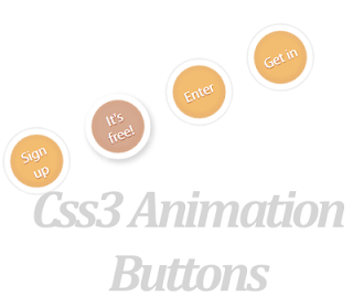
Today im gonna explain how to add css3 stylish animated buttons for your blogger. you can
use
this buttons as download buttons, demo buttons,
redirect to other page and etc.Im using CSS and
HTML for this. you can use this button code in to your blogger post too.Check my earlier post about
Button codes here.
Demo
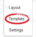
1. Log in to blogger account and Click drop down.
2. Now select "
Template" Like Below.
3. Now you can see Live on blog, Click
EDIT HTML Button"
4. Now click
Proceed button.
5. Find this tag by using Ctrl+F
]]></b:skin>
6. Paste below code Before
]]></b:skin> tag
.button{
font:15px Calibri, Arial, sans-serif;
text-shadow:1px 1px 0 rgba(255,255,255,0.4);
text-decoration:none !important;
white-space:nowrap;
display:inline-block;
vertical-align:baseline;
position:relative;
cursor:pointer;
padding:10px 20px;
background-repeat:no-repeat;
background-position:bottom left;
background-image:url('https://blogger.googleusercontent.com/img/b/R29vZ2xl/AVvXsEiG5WHZqtpOBfcpfA4iOTIhUS1UoVenD9VC6bITZCx9WVhgIoA4bc0mTgT4YTWsa9WW7kkc5Y4l9QdRn7FBOxiYnDgCu6fzqFpraZhZmCnVH0jLLPhWm9w9IqzRQeKdK2GB4O8sMufHfGeI/s144/button_bg.png');
background-position:bottom left, top right, 0 0, 0 0;
background-clip:border-box;
-moz-border-radius:8px;
-webkit-border-radius:8px;
border-radius:8px;
-moz-box-shadow:0 0 1px #fff inset;
-webkit-box-shadow:0 0 1px #fff inset;
box-shadow:0 0 1px #fff inset;
-webkit-transition:background-position 1s;
-moz-transition:background-position 1s;
transition:background-position 1s;
}
.button:hover{
background-position:top left;
background-position:top left, bottom right, 0 0, 0 0;
}
.button:active{
bottom:-1px;
}
/* The three buttons sizes */
.button.big { font-size:30px;}
.button.medium { font-size:18px;}
.button.small { font-size:13px;}
/* BlueButton */
.blue.button{
color:#0f4b6d !important;
border:1px solid #84acc3 !important;
background-color: #48b5f2;
background-image: url('https://blogger.googleusercontent.com/img/b/R29vZ2xl/AVvXsEiG5WHZqtpOBfcpfA4iOTIhUS1UoVenD9VC6bITZCx9WVhgIoA4bc0mTgT4YTWsa9WW7kkc5Y4l9QdRn7FBOxiYnDgCu6fzqFpraZhZmCnVH0jLLPhWm9w9IqzRQeKdK2GB4O8sMufHfGeI/s144/button_bg.png'), url('https://blogger.googleusercontent.com/img/b/R29vZ2xl/AVvXsEiG5WHZqtpOBfcpfA4iOTIhUS1UoVenD9VC6bITZCx9WVhgIoA4bc0mTgT4YTWsa9WW7kkc5Y4l9QdRn7FBOxiYnDgCu6fzqFpraZhZmCnVH0jLLPhWm9w9IqzRQeKdK2GB4O8sMufHfGeI/s144/button_bg.png'),
-moz-radial-gradient( center bottom, circle,
rgba(89,208,244,1) 0,rgba(89,208,244,0) 100px),
-moz-linear-gradient(#4fbbf7, #3faeeb);
background-image: url('https://blogger.googleusercontent.com/img/b/R29vZ2xl/AVvXsEiG5WHZqtpOBfcpfA4iOTIhUS1UoVenD9VC6bITZCx9WVhgIoA4bc0mTgT4YTWsa9WW7kkc5Y4l9QdRn7FBOxiYnDgCu6fzqFpraZhZmCnVH0jLLPhWm9w9IqzRQeKdK2GB4O8sMufHfGeI/s144/button_bg.png'), url('https://blogger.googleusercontent.com/img/b/R29vZ2xl/AVvXsEiG5WHZqtpOBfcpfA4iOTIhUS1UoVenD9VC6bITZCx9WVhgIoA4bc0mTgT4YTWsa9WW7kkc5Y4l9QdRn7FBOxiYnDgCu6fzqFpraZhZmCnVH0jLLPhWm9w9IqzRQeKdK2GB4O8sMufHfGeI/s144/button_bg.png'),
-webkit-gradient( radial, 50% 100%, 0, 50% 100%, 100,
from(rgba(89,208,244,1)), to(rgba(89,208,244,0))),
-webkit-gradient(linear, 0% 0%, 0% 100%, from(#4fbbf7), to(#3faeeb));
}
.blue.button:hover{
background-color:#63c7fe;
background-image: url('https://blogger.googleusercontent.com/img/b/R29vZ2xl/AVvXsEiG5WHZqtpOBfcpfA4iOTIhUS1UoVenD9VC6bITZCx9WVhgIoA4bc0mTgT4YTWsa9WW7kkc5Y4l9QdRn7FBOxiYnDgCu6fzqFpraZhZmCnVH0jLLPhWm9w9IqzRQeKdK2GB4O8sMufHfGeI/s144/button_bg.png'), url('https://blogger.googleusercontent.com/img/b/R29vZ2xl/AVvXsEiG5WHZqtpOBfcpfA4iOTIhUS1UoVenD9VC6bITZCx9WVhgIoA4bc0mTgT4YTWsa9WW7kkc5Y4l9QdRn7FBOxiYnDgCu6fzqFpraZhZmCnVH0jLLPhWm9w9IqzRQeKdK2GB4O8sMufHfGeI/s144/button_bg.png'),
-moz-radial-gradient( center bottom, circle,
rgba(109,217,250,1) 0,rgba(109,217,250,0) 100px),
-moz-linear-gradient(#63c7fe, #58bef7);
background-image: url('https://blogger.googleusercontent.com/img/b/R29vZ2xl/AVvXsEiG5WHZqtpOBfcpfA4iOTIhUS1UoVenD9VC6bITZCx9WVhgIoA4bc0mTgT4YTWsa9WW7kkc5Y4l9QdRn7FBOxiYnDgCu6fzqFpraZhZmCnVH0jLLPhWm9w9IqzRQeKdK2GB4O8sMufHfGeI/s144/button_bg.png'), url('https://blogger.googleusercontent.com/img/b/R29vZ2xl/AVvXsEiG5WHZqtpOBfcpfA4iOTIhUS1UoVenD9VC6bITZCx9WVhgIoA4bc0mTgT4YTWsa9WW7kkc5Y4l9QdRn7FBOxiYnDgCu6fzqFpraZhZmCnVH0jLLPhWm9w9IqzRQeKdK2GB4O8sMufHfGeI/s144/button_bg.png'),
-webkit-gradient( radial, 50% 100%, 0, 50% 100%, 100,
from(rgba(109,217,250,1)), to(rgba(109,217,250,0))),
-webkit-gradient(linear, 0% 0%, 0% 100%, from(#63c7fe), to(#58bef7));
}
/* Green Button */
.green.button{
color:#345903 !important;
border:1px solid #96a37b !important;
background-color: #79be1e;
background-image:url('https://blogger.googleusercontent.com/img/b/R29vZ2xl/AVvXsEiG5WHZqtpOBfcpfA4iOTIhUS1UoVenD9VC6bITZCx9WVhgIoA4bc0mTgT4YTWsa9WW7kkc5Y4l9QdRn7FBOxiYnDgCu6fzqFpraZhZmCnVH0jLLPhWm9w9IqzRQeKdK2GB4O8sMufHfGeI/s144/button_bg.png'), url('https://blogger.googleusercontent.com/img/b/R29vZ2xl/AVvXsEiG5WHZqtpOBfcpfA4iOTIhUS1UoVenD9VC6bITZCx9WVhgIoA4bc0mTgT4YTWsa9WW7kkc5Y4l9QdRn7FBOxiYnDgCu6fzqFpraZhZmCnVH0jLLPhWm9w9IqzRQeKdK2GB4O8sMufHfGeI/s144/button_bg.png'), -moz-radial-gradient(center bottom, circle, rgba(162,211,30,1) 0,rgba(162,211,30,0) 100px),-moz-linear-gradient(#82cc27, #74b317);
background-image:url('https://blogger.googleusercontent.com/img/b/R29vZ2xl/AVvXsEiG5WHZqtpOBfcpfA4iOTIhUS1UoVenD9VC6bITZCx9WVhgIoA4bc0mTgT4YTWsa9WW7kkc5Y4l9QdRn7FBOxiYnDgCu6fzqFpraZhZmCnVH0jLLPhWm9w9IqzRQeKdK2GB4O8sMufHfGeI/s144/button_bg.png'), url('https://blogger.googleusercontent.com/img/b/R29vZ2xl/AVvXsEiG5WHZqtpOBfcpfA4iOTIhUS1UoVenD9VC6bITZCx9WVhgIoA4bc0mTgT4YTWsa9WW7kkc5Y4l9QdRn7FBOxiYnDgCu6fzqFpraZhZmCnVH0jLLPhWm9w9IqzRQeKdK2GB4O8sMufHfGeI/s144/button_bg.png'), -webkit-gradient(radial, 50% 100%, 0, 50% 100%, 100, from(rgba(162,211,30,1)), to(rgba(162,211,30,0))),-webkit-gradient(linear, 0% 0%, 0% 100%, from(#82cc27), to(#74b317));
}
.green.button:hover{
background-color:#89d228;
background-image:url('https://blogger.googleusercontent.com/img/b/R29vZ2xl/AVvXsEiG5WHZqtpOBfcpfA4iOTIhUS1UoVenD9VC6bITZCx9WVhgIoA4bc0mTgT4YTWsa9WW7kkc5Y4l9QdRn7FBOxiYnDgCu6fzqFpraZhZmCnVH0jLLPhWm9w9IqzRQeKdK2GB4O8sMufHfGeI/s144/button_bg.png'), url('https://blogger.googleusercontent.com/img/b/R29vZ2xl/AVvXsEiG5WHZqtpOBfcpfA4iOTIhUS1UoVenD9VC6bITZCx9WVhgIoA4bc0mTgT4YTWsa9WW7kkc5Y4l9QdRn7FBOxiYnDgCu6fzqFpraZhZmCnVH0jLLPhWm9w9IqzRQeKdK2GB4O8sMufHfGeI/s144/button_bg.png'), -moz-radial-gradient(center bottom, circle, rgba(183,229,45,1) 0,rgba(183,229,45,0) 100px),-moz-linear-gradient(#90de31, #7fc01e);
background-image:url('https://blogger.googleusercontent.com/img/b/R29vZ2xl/AVvXsEiG5WHZqtpOBfcpfA4iOTIhUS1UoVenD9VC6bITZCx9WVhgIoA4bc0mTgT4YTWsa9WW7kkc5Y4l9QdRn7FBOxiYnDgCu6fzqFpraZhZmCnVH0jLLPhWm9w9IqzRQeKdK2GB4O8sMufHfGeI/s144/button_bg.png'), url('https://blogger.googleusercontent.com/img/b/R29vZ2xl/AVvXsEiG5WHZqtpOBfcpfA4iOTIhUS1UoVenD9VC6bITZCx9WVhgIoA4bc0mTgT4YTWsa9WW7kkc5Y4l9QdRn7FBOxiYnDgCu6fzqFpraZhZmCnVH0jLLPhWm9w9IqzRQeKdK2GB4O8sMufHfGeI/s144/button_bg.png'), -webkit-gradient(radial, 50% 100%, 0, 50% 100%, 100, from(rgba(183,229,45,1)), to(rgba(183,229,45,0))),-webkit-gradient(linear, 0% 0%, 0% 100%, from(#90de31), to(#7fc01e));
}
/* Orange Button */
.orange.button{
color:#693e0a !important;
border:1px solid #bea280 !important;
background-color: #e38d27;
background-image:url('https://blogger.googleusercontent.com/img/b/R29vZ2xl/AVvXsEiG5WHZqtpOBfcpfA4iOTIhUS1UoVenD9VC6bITZCx9WVhgIoA4bc0mTgT4YTWsa9WW7kkc5Y4l9QdRn7FBOxiYnDgCu6fzqFpraZhZmCnVH0jLLPhWm9w9IqzRQeKdK2GB4O8sMufHfGeI/s144/button_bg.png'), url('https://blogger.googleusercontent.com/img/b/R29vZ2xl/AVvXsEiG5WHZqtpOBfcpfA4iOTIhUS1UoVenD9VC6bITZCx9WVhgIoA4bc0mTgT4YTWsa9WW7kkc5Y4l9QdRn7FBOxiYnDgCu6fzqFpraZhZmCnVH0jLLPhWm9w9IqzRQeKdK2GB4O8sMufHfGeI/s144/button_bg.png'), -moz-radial-gradient(center bottom, circle, rgba(232,189,45,1) 0,rgba(232,189,45,0) 100px),-moz-linear-gradient(#f1982f, #d4821f);
background-image:url('https://blogger.googleusercontent.com/img/b/R29vZ2xl/AVvXsEiG5WHZqtpOBfcpfA4iOTIhUS1UoVenD9VC6bITZCx9WVhgIoA4bc0mTgT4YTWsa9WW7kkc5Y4l9QdRn7FBOxiYnDgCu6fzqFpraZhZmCnVH0jLLPhWm9w9IqzRQeKdK2GB4O8sMufHfGeI/s144/button_bg.png'), url('https://blogger.googleusercontent.com/img/b/R29vZ2xl/AVvXsEiG5WHZqtpOBfcpfA4iOTIhUS1UoVenD9VC6bITZCx9WVhgIoA4bc0mTgT4YTWsa9WW7kkc5Y4l9QdRn7FBOxiYnDgCu6fzqFpraZhZmCnVH0jLLPhWm9w9IqzRQeKdK2GB4O8sMufHfGeI/s144/button_bg.png'), -webkit-gradient(radial, 50% 100%, 0, 50% 100%, 100, from(rgba(232,189,45,1)), to(rgba(232,189,45,0))),-webkit-gradient(linear, 0% 0%, 0% 100%, from(#f1982f), to(#d4821f));
}
.orange.button:hover{
background-color:#ec9732;
background-image:url('https://blogger.googleusercontent.com/img/b/R29vZ2xl/AVvXsEiG5WHZqtpOBfcpfA4iOTIhUS1UoVenD9VC6bITZCx9WVhgIoA4bc0mTgT4YTWsa9WW7kkc5Y4l9QdRn7FBOxiYnDgCu6fzqFpraZhZmCnVH0jLLPhWm9w9IqzRQeKdK2GB4O8sMufHfGeI/s144/button_bg.png'), url('https://blogger.googleusercontent.com/img/b/R29vZ2xl/AVvXsEiG5WHZqtpOBfcpfA4iOTIhUS1UoVenD9VC6bITZCx9WVhgIoA4bc0mTgT4YTWsa9WW7kkc5Y4l9QdRn7FBOxiYnDgCu6fzqFpraZhZmCnVH0jLLPhWm9w9IqzRQeKdK2GB4O8sMufHfGeI/s144/button_bg.png'), -moz-radial-gradient(center bottom, circle, rgba(241,192,52,1) 0,rgba(241,192,52,0) 100px),-moz-linear-gradient(#f9a746, #e18f2b);
background-image:url('https://blogger.googleusercontent.com/img/b/R29vZ2xl/AVvXsEiG5WHZqtpOBfcpfA4iOTIhUS1UoVenD9VC6bITZCx9WVhgIoA4bc0mTgT4YTWsa9WW7kkc5Y4l9QdRn7FBOxiYnDgCu6fzqFpraZhZmCnVH0jLLPhWm9w9IqzRQeKdK2GB4O8sMufHfGeI/s144/button_bg.png'), url('https://blogger.googleusercontent.com/img/b/R29vZ2xl/AVvXsEiG5WHZqtpOBfcpfA4iOTIhUS1UoVenD9VC6bITZCx9WVhgIoA4bc0mTgT4YTWsa9WW7kkc5Y4l9QdRn7FBOxiYnDgCu6fzqFpraZhZmCnVH0jLLPhWm9w9IqzRQeKdK2GB4O8sMufHfGeI/s144/button_bg.png'), -webkit-gradient(radial, 50% 100%, 0, 50% 100%, 100, from(rgba(241,192,52,1)), to(rgba(241,192,52,0))),-webkit-gradient(linear, 0% 0%, 0% 100%, from(#f9a746), to(#e18f2b));
}
/* Orange Button */
.gray.button{
color:#525252 !important;
border:1px solid #a5a5a5 !important;
background-color: #a9adb1;
background-image:url('https://blogger.googleusercontent.com/img/b/R29vZ2xl/AVvXsEiG5WHZqtpOBfcpfA4iOTIhUS1UoVenD9VC6bITZCx9WVhgIoA4bc0mTgT4YTWsa9WW7kkc5Y4l9QdRn7FBOxiYnDgCu6fzqFpraZhZmCnVH0jLLPhWm9w9IqzRQeKdK2GB4O8sMufHfGeI/s144/button_bg.png'), url('https://blogger.googleusercontent.com/img/b/R29vZ2xl/AVvXsEiG5WHZqtpOBfcpfA4iOTIhUS1UoVenD9VC6bITZCx9WVhgIoA4bc0mTgT4YTWsa9WW7kkc5Y4l9QdRn7FBOxiYnDgCu6fzqFpraZhZmCnVH0jLLPhWm9w9IqzRQeKdK2GB4O8sMufHfGeI/s144/button_bg.png'), -moz-radial-gradient(center bottom, circle, rgba(197,199,202,1) 0,rgba(197,199,202,0) 100px),-moz-linear-gradient(#c5c7ca, #92989c);
background-image:url('https://blogger.googleusercontent.com/img/b/R29vZ2xl/AVvXsEiG5WHZqtpOBfcpfA4iOTIhUS1UoVenD9VC6bITZCx9WVhgIoA4bc0mTgT4YTWsa9WW7kkc5Y4l9QdRn7FBOxiYnDgCu6fzqFpraZhZmCnVH0jLLPhWm9w9IqzRQeKdK2GB4O8sMufHfGeI/s144/button_bg.png'), url('https://blogger.googleusercontent.com/img/b/R29vZ2xl/AVvXsEiG5WHZqtpOBfcpfA4iOTIhUS1UoVenD9VC6bITZCx9WVhgIoA4bc0mTgT4YTWsa9WW7kkc5Y4l9QdRn7FBOxiYnDgCu6fzqFpraZhZmCnVH0jLLPhWm9w9IqzRQeKdK2GB4O8sMufHfGeI/s144/button_bg.png'), -webkit-gradient(radial, 50% 100%, 0, 50% 100%, 100, from(rgba(197,199,202,1)), to(rgba(197,199,202,0))),-webkit-gradient(linear, 0% 0%, 0% 100%, from(#c5c7ca), to(#92989c));
}
.gray.button:hover{
background-color:#b6bbc0;
background-image:url('https://blogger.googleusercontent.com/img/b/R29vZ2xl/AVvXsEiG5WHZqtpOBfcpfA4iOTIhUS1UoVenD9VC6bITZCx9WVhgIoA4bc0mTgT4YTWsa9WW7kkc5Y4l9QdRn7FBOxiYnDgCu6fzqFpraZhZmCnVH0jLLPhWm9w9IqzRQeKdK2GB4O8sMufHfGeI/s144/button_bg.png'), url('https://blogger.googleusercontent.com/img/b/R29vZ2xl/AVvXsEiG5WHZqtpOBfcpfA4iOTIhUS1UoVenD9VC6bITZCx9WVhgIoA4bc0mTgT4YTWsa9WW7kkc5Y4l9QdRn7FBOxiYnDgCu6fzqFpraZhZmCnVH0jLLPhWm9w9IqzRQeKdK2GB4O8sMufHfGeI/s144/button_bg.png'), -moz-radial-gradient(center bottom, circle, rgba(202,205,208,1) 0,rgba(202,205,208,0) 100px),-moz-linear-gradient(#d1d3d6, #9fa5a9);
background-image:url('https://blogger.googleusercontent.com/img/b/R29vZ2xl/AVvXsEiG5WHZqtpOBfcpfA4iOTIhUS1UoVenD9VC6bITZCx9WVhgIoA4bc0mTgT4YTWsa9WW7kkc5Y4l9QdRn7FBOxiYnDgCu6fzqFpraZhZmCnVH0jLLPhWm9w9IqzRQeKdK2GB4O8sMufHfGeI/s144/button_bg.png'), url('https://blogger.googleusercontent.com/img/b/R29vZ2xl/AVvXsEiG5WHZqtpOBfcpfA4iOTIhUS1UoVenD9VC6bITZCx9WVhgIoA4bc0mTgT4YTWsa9WW7kkc5Y4l9QdRn7FBOxiYnDgCu6fzqFpraZhZmCnVH0jLLPhWm9w9IqzRQeKdK2GB4O8sMufHfGeI/s144/button_bg.png'), -webkit-gradient(radial, 50% 100%, 0, 50% 100%, 100, from(rgba(202,205,208,1)), to(rgba(202,205,208,0))),-webkit-gradient(linear, 0% 0%, 0% 100%, from(#d1d3d6), to(#9fa5a9));
}
7. Go to blogger and click
Layout
8. Click
Add Gadget and select
'HTML/Javascript
9. Paste below code.
(You can use this code anywhere in your post.)
<a class="button big blue" href="Your Link" target="_blank">Live Demo</a>

<a class="button big orange" href="Your Link" target="_blank">Live Demo</a>

<a class="button big green" href="Your Link" target="_blank">Live Demo</a>

<a class="button big gray" href="Your Link" target="_blank">Live Demo</a>
Replace with your links.
10. Now save your
HTML/Javascript'.
You are done...


 Author Bio: Sohan Jayasinghe
is the owner and author of Bloggertrix.com .He has been blogging since
2009 and writing Blogger trix since 2010.If you want to contact him,
Just leave a message via contact us page or connect with facebook or twitter
Author Bio: Sohan Jayasinghe
is the owner and author of Bloggertrix.com .He has been blogging since
2009 and writing Blogger trix since 2010.If you want to contact him,
Just leave a message via contact us page or connect with facebook or twitter


