
Today im gonna explain how to add add dark style vertical menu for blogger for your blog. Vertical
menu also very important when we want to link some pages on sidebar. Its include attractive dark
color style.Im using Css and HTML For this menu. This work with all browsers well.You can get my
all vertical here

Demo
1. Log in to blogger account and Click drop down.
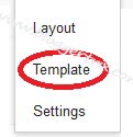
 2. Now select "Template" Like Below.
3. Now you can see Live on blog, Click EDIT HTML Button"
4. Now click Proceed button.
5. Find this tag by using Ctrl+F ]]></b:skin>
6. Paste below code Before ]]></b:skin> tag
7. Go to blogger and click Layout
8. Click Add Gadget and select 'HTML/Javascript
9. Paste below code.
10. Now save your HTML/Javascript'.
You are done...
menu also very important when we want to link some pages on sidebar. Its include attractive dark
color style.Im using Css and HTML For this menu. This work with all browsers well.You can get my
all vertical here
1. Log in to blogger account and Click drop down.
3. Now you can see Live on blog, Click EDIT HTML Button"
4. Now click Proceed button.
5. Find this tag by using Ctrl+F ]]></b:skin>
6. Paste below code Before ]]></b:skin> tag
/* The CSS Code for the menu starts here bloggertrix.com */
.button {
  outline: 0;
  padding: 5px 12px;
  display: block;
  color: #9fa8b0;
  font-weight: bold;
  text-shadow: 1px 1px #1f272b;
  border: 1px solid #1c252b;
  border-radius: 3px;
  -moz-border-radius: 3px;
  -webkit-border-radius: 3px;
  background: #232B30; /* old browsers */
  background: -moz-linear-gradient(top, #3D4850 3%, #313d45 4%, #232B30 100%); /* firefox */
  background: -webkit-gradient(linear, left top, left bottom, color-stop(3%,#3D4850), color-stop(4%,#313d45), color-stop(100%,#232B30)); /* webkit */
  filter: progid:DXImageTransform.Microsoft.gradient( startColorstr='#3D4850', endColorstr='#232B30',GradientType=0 ); /* ie */
  box-shadow: 1px 1px 1px rgba(0,0,0,0.2); /* CSS3 */
  -moz-box-shadow: 1px 1px 1px rgba(0,0,0,0.2); /* Firefox */
  -webkit-box-shadow: 1px 1px 1px rgba(0,0,0,0.2); /* Safari, Chrome */
 }
 .button:hover {
  color: #fff;
  background: #4C5A64; /* old browsers */
  background: -moz-linear-gradient(top, #4C5A64 3%, #404F5A 4%, #2E3940 100%); /* firefox */
  background: -webkit-gradient(linear, left top, left bottom, color-stop(3%,#4C5A64), color-stop(4%,#404F5A), color-stop(100%,#2E3940)); /* webkit */
  filter: progid:DXImageTransform.Microsoft.gradient( startColorstr='#4C5A64', endColorstr='#2E3940',GradientType=0 ); /* ie */
 }
 .button:active {
  background-position: 0 top;
  position: relative;
  top: 1px;
  color: #fff;
  padding: 6px 12px 4px;
  background: #20282D; /* old browsers */
  background: -moz-linear-gradient(top, #20282D 3%, #252E34 51%, #222A30 100%); /* firefox */
  background: -webkit-gradient(linear, left top, left bottom, color-stop(3%,#20282D), color-stop(51%,#252E34), color-stop(100%,#222A30)); /* webkit */
  filter: progid:DXImageTransform.Microsoft.gradient( startColorstr='#20282D', endColorstr='#222A30',GradientType=0 ); /* ie */
  -moz-box-shadow: 1px 1px 1px rgba(255,255,255,0.1); /* Firefox */
  -webkit-box-shadow: 1px 1px 1px rgba(255,255,255,0.1); /* Safari, Chrome */
  box-shadow: 1px 1px 1px rgba(255,255,255,0.1); /* CSS3 */
 }

 /* Other stuff: */
 .button-list { list-style: none; padding: 0; margin: 0; width: 100%; float: left; display: block; margin: 0 0 30px; }
 .button-list li { float: left; margin: 0 10px 0 0; }
 .button-list li.search { border-left: 1px solid #273137; padding-left: 18px; margin-left: 10px; position: relative; }

 /* Vertical List: */
 .vertical-list {
  list-style: none;
  padding: 10px;
  width: 200px;
  border-radius: 5px;
  -moz-border-radius: 5px;
  -webkit-border-radius: 5px;
  background: #20282D; /* old browsers */
  background: -moz-linear-gradient(top, #20282D 3%, #252E34 51%, #222A30 100%); /* firefox */
  background: -webkit-gradient(linear, left top, left bottom, color-stop(3%,#20282D), color-stop(51%,#252E34), color-stop(100%,#222A30)); /* webkit */
  filter: progid:DXImageTransform.Microsoft.gradient( startColorstr='#20282D', endColorstr='#222A30',GradientType=0 ); /* ie */
  -moz-box-shadow: 1px 1px 1px rgba(255,255,255,0.1); /* Firefox */
  -webkit-box-shadow: 1px 1px 1px rgba(255,255,255,0.1); /* Safari, Chrome */
  box-shadow: 1px 1px 1px rgba(255,255,255,0.1); /* CSS3 */
 }
 .vertical-list .button {
  border-radius: 5px;
  -moz-border-radius: 5px;
  -webkit-border-radius: 5px;
  background: #515B62; /* old browsers */
  background: -moz-linear-gradient(top, #515B62 3%, #444E55 5%, #394147 100%); /* firefox */
  background: -webkit-gradient(linear, left top, left bottom, color-stop(3%,#515B62), color-stop(5%,#444E55), color-stop(100%,#394147)); /* webkit */
  filter: progid:DXImageTransform.Microsoft.gradient( startColorstr='#515B62', endColorstr='#394147',GradientType=0 ); /* ie */
 }
 .vertical-list .button:hover {
  background: #5F6B72; /* old browsers */
  background: -moz-linear-gradient(top, #5F6B72 3%, #56646C 4%, #4D5A62 50%, #434D54 100%); /* firefox */
  background: -webkit-gradient(linear, left top, left bottom, color-stop(3%,#5F6B72), color-stop(4%,#56646C), color-stop(50%,#4D5A62), color-stop(100%,#434D54)); /* webkit */
  filter: progid:DXImageTransform.Microsoft.gradient( startColorstr='#5F6B72', endColorstr='#434D54',GradientType=0 ); /* ie */
 }
 .vertical-list .button:active {
  padding: 5px 12px;
  top: 0;
  background: #515B62; /* old browsers */
  background: -moz-linear-gradient(top, #515B62 3%, #444E55 5%, #394147 100%); /* firefox */
  background: -webkit-gradient(linear, left top, left bottom, color-stop(3%,#515B62), color-stop(5%,#444E55), color-stop(100%,#394147)); /* webkit */
  filter: progid:DXImageTransform.Microsoft.gradient( startColorstr='#515B62', endColorstr='#394147',GradientType=0 ); /* ie */  -moz-box-shadow: 1px 1px 1px rgba(255,255,255,0.1); /* Firefox */
  -moz-box-shadow: 1px 1px 1px rgba(0,0,0,0.2); /* Firefox */
  -webkit-box-shadow: 1px 1px 1px rgba(0,0,0,0.2); /* Safari, Chrome */
  box-shadow: 1px 1px 1px rgba(0,0,0,0.2); /* CSS3 */
}
 .vertical-list li { margin: 0 0 5px; }
 .vertical-list li:last-child { margin: 0; }
7. Go to blogger and click Layout
8. Click Add Gadget and select 'HTML/Javascript
9. Paste below code.
<ul class="vertical-list">
        <li><a href='#' class='button'">Home</a></li>
        <li><a href='#' class='button'">Our Studio</a></li>
        <li><a href='#' class='button'">Portfolio</a></li>
        <li><a href='#' class='button'">Our Team</a></li>
        <li><a href='#' class='button';">About US</a></li>
</ul>
Replace # with your links.10. Now save your HTML/Javascript'.
You are done...


Nice post, thanks for sharing
ReplyDeleteThanks for the post and it's clear and brief to understand and easy to go through the following steps.
ReplyDelete