
In this post im gonna explain how to add image hover effect description for blogger. You can use this effect for your special images. Im using CSS and HTML for this Effect.You can get my earlier image effect post by clicking here.
 Demo
Demo
1. Log in to blogger account and Click drop down.
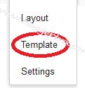
 2. Now select "Template" Like Below.
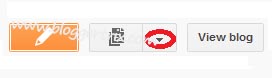
3. Now you can see Live on blog, Click EDIT HTML Button"
4. Now click Proceed button.
5.Find this code by using Ctrl+F ]]></b:skin>
6. Paste below code Before ]]></b:skin> code
7. Go to blogger and click drop-down like 1st step and select Layout
8. Click Add Gadget and select 'HTML/Javascript"
9. Paste below code.
10. Now save your template. You are done.
3. Now you can see Live on blog, Click EDIT HTML Button"
4. Now click Proceed button.
5.Find this code by using Ctrl+F ]]></b:skin>
6. Paste below code Before ]]></b:skin> code
.imagepluscontainer{ /* main image container */
position: relative;
z-index: 1;
}

.imagepluscontainer img{ /* CSS for image within container */
position: relative;
z-index: 2;
-moz-transition: all 0.5s ease; /* Enable CSS3 transition on all props */
-webkit-transition: all 0.5s ease-in-out;
-o-transition: all 0.5s ease-in-out;
-ms-transition: all 0.5s ease-in-out;
transition: all 0.5s ease-in-out;
}

.imagepluscontainer:hover img{ /* CSS for image when mouse hovers over main container */
-moz-box-shadow: 5px 5px 5px rgba(0, 0, 0, 0.5);
-webkit-box-shadow: 5px 5px 5px rgba(0, 0, 0, 0.5);
box-shadow: 5px 5px 5px rgba(0, 0, 0, 0.5);
-moz-transform: scale(1.05, 1.05);
-webkit-transform: scale(1.05, 1.05);
-ms-transform: scale(1.05, 1.05);
-o-transform: scale(1.05, 1.05);
transform: scale(1.05, 1.05);
}

.imagepluscontainer div.desc{ /* CSS for desc div of each image. */
position: absolute;
width: 90%;
z-index: 1; /* Set z-index to that less than image's, so it's hidden beneath it */
bottom: 0; /* Default position of desc div is bottom of container, setting it up to slide down */
left: 5px;
padding: 8px;
background: rgba(0, 0, 0, 0.8); /* black bg with 80% opacity */
color: white;
-moz-border-radius: 0 0 8px 8px; /* CSS3 rounded borders */
-webkit-border-radius: 0 0 8px 8px;
border-radius: 0 0 8px 8px;
opacity: 0; /* Set initial opacity to 0 */
-moz-box-shadow: 0 0 6px rgba(0, 0, 0, 0.8); /* CSS3 shadows */
-webkit-box-shadow: 0 0 6px rgba(0, 0, 0, 0.8);
box-shadow: 0 0 6px rgba(0, 0, 0, 0.8);
-moz-transition: all 0.5s ease 0.5s; /* Enable CSS3 transition on desc div. Final 0.5s value is the delay before animation starts */
-webkit-transition: all 0.5s ease 0.5s;
-o-transition: all 0.5s ease 0.5s;
-ms-transition: all 0.5s ease 0.5s;
transition: all 0.5s ease 0.5s;
}

.imagepluscontainer div.desc a{
color: white;
}

.imagepluscontainer:hover div.desc{ /* CSS for desc div when mouse hovers over main container */

-moz-transform: translate(0, 100%);
-webkit-transform: translate(0, 100%);
-ms-transform: translate(0, 100%);
-o-transform: translate(0, 100%);
transform: translate(0, 100%);
opacity:1; /* Reveal desc DIV fully */
}
7. Go to blogger and click drop-down like 1st step and select Layout
8. Click Add Gadget and select 'HTML/Javascript"
9. Paste below code.
<div class="imagepluscontainer" style="width:263px; height:199px; z-index:2">
<img src="https://blogger.googleusercontent.com/img/b/R29vZ2xl/AVvXsEhT4R0izOEGsSV1oHxC2k-9Vhz8Ob6xafRHDe_qHj1dFLEW1IBf2SR8RrGPS3t2P65WUHzZYeMu9j_0AJwmGZOrhLngaOlmiGpmwOJA7PSqhTMjxgljgdVPER1TH6dLbdqZbw77UoeCC4Y/s1600/nature.jpg" />
<div class="desc">
Lorem ipsum dolor sit amet, consectetuer adipiscing elit. Curabitur quam augue, vehicula quis, tincidunt vel, varius vitae, nulla. Sed convallis orci. Duis libero orci.
</div>
</div>
*you can replace URL and text.
10. Now save your template. You are done.


nice one :D
ReplyDelete@Limit Post
ReplyDeleteThanks you..