Today im gonna explain how to add css3 stylish animated buttons for your blogger. you can
use
this buttons as download buttons, demo buttons,
redirect to other page and etc.Im using CSS and
HTML for this. you can use this button code in to your blogger post too.Check my earlier post about
Button codes here.
Demo
1. Log in to blogger account and Click drop down.
2. Now select "
Template" Like Below.
3. Now you can see Live on blog, Click
EDIT HTML Button"
4. Now click
Proceed button.
5. Find this tag by using Ctrl+F
]]></b:skin>
6. Paste below code Before
]]></b:skin> tag
.button{
font:15px Calibri, Arial, sans-serif;
text-shadow:1px 1px 0 rgba(255,255,255,0.4);
text-decoration:none !important;
white-space:nowrap;
display:inline-block;
vertical-align:baseline;
position:relative;
cursor:pointer;
padding:10px 20px;
background-repeat:no-repeat;
background-position:bottom left;
background-image:url('https://blogger.googleusercontent.com/img/b/R29vZ2xl/AVvXsEiG5WHZqtpOBfcpfA4iOTIhUS1UoVenD9VC6bITZCx9WVhgIoA4bc0mTgT4YTWsa9WW7kkc5Y4l9QdRn7FBOxiYnDgCu6fzqFpraZhZmCnVH0jLLPhWm9w9IqzRQeKdK2GB4O8sMufHfGeI/s144/button_bg.png');
background-position:bottom left, top right, 0 0, 0 0;
background-clip:border-box;
-moz-border-radius:8px;
-webkit-border-radius:8px;
border-radius:8px;
-moz-box-shadow:0 0 1px #fff inset;
-webkit-box-shadow:0 0 1px #fff inset;
box-shadow:0 0 1px #fff inset;
-webkit-transition:background-position 1s;
-moz-transition:background-position 1s;
transition:background-position 1s;
}
.button:hover{
background-position:top left;
background-position:top left, bottom right, 0 0, 0 0;
}
.button:active{
bottom:-1px;
}
/* The three buttons sizes */
.button.big { font-size:30px;}
.button.medium { font-size:18px;}
.button.small { font-size:13px;}
/* BlueButton */
.blue.button{
color:#0f4b6d !important;
border:1px solid #84acc3 !important;
background-color: #48b5f2;
background-image: url('https://blogger.googleusercontent.com/img/b/R29vZ2xl/AVvXsEiG5WHZqtpOBfcpfA4iOTIhUS1UoVenD9VC6bITZCx9WVhgIoA4bc0mTgT4YTWsa9WW7kkc5Y4l9QdRn7FBOxiYnDgCu6fzqFpraZhZmCnVH0jLLPhWm9w9IqzRQeKdK2GB4O8sMufHfGeI/s144/button_bg.png'), url('https://blogger.googleusercontent.com/img/b/R29vZ2xl/AVvXsEiG5WHZqtpOBfcpfA4iOTIhUS1UoVenD9VC6bITZCx9WVhgIoA4bc0mTgT4YTWsa9WW7kkc5Y4l9QdRn7FBOxiYnDgCu6fzqFpraZhZmCnVH0jLLPhWm9w9IqzRQeKdK2GB4O8sMufHfGeI/s144/button_bg.png'),
-moz-radial-gradient( center bottom, circle,
rgba(89,208,244,1) 0,rgba(89,208,244,0) 100px),
-moz-linear-gradient(#4fbbf7, #3faeeb);
background-image: url('https://blogger.googleusercontent.com/img/b/R29vZ2xl/AVvXsEiG5WHZqtpOBfcpfA4iOTIhUS1UoVenD9VC6bITZCx9WVhgIoA4bc0mTgT4YTWsa9WW7kkc5Y4l9QdRn7FBOxiYnDgCu6fzqFpraZhZmCnVH0jLLPhWm9w9IqzRQeKdK2GB4O8sMufHfGeI/s144/button_bg.png'), url('https://blogger.googleusercontent.com/img/b/R29vZ2xl/AVvXsEiG5WHZqtpOBfcpfA4iOTIhUS1UoVenD9VC6bITZCx9WVhgIoA4bc0mTgT4YTWsa9WW7kkc5Y4l9QdRn7FBOxiYnDgCu6fzqFpraZhZmCnVH0jLLPhWm9w9IqzRQeKdK2GB4O8sMufHfGeI/s144/button_bg.png'),
-webkit-gradient( radial, 50% 100%, 0, 50% 100%, 100,
from(rgba(89,208,244,1)), to(rgba(89,208,244,0))),
-webkit-gradient(linear, 0% 0%, 0% 100%, from(#4fbbf7), to(#3faeeb));
}
.blue.button:hover{
background-color:#63c7fe;
background-image: url('https://blogger.googleusercontent.com/img/b/R29vZ2xl/AVvXsEiG5WHZqtpOBfcpfA4iOTIhUS1UoVenD9VC6bITZCx9WVhgIoA4bc0mTgT4YTWsa9WW7kkc5Y4l9QdRn7FBOxiYnDgCu6fzqFpraZhZmCnVH0jLLPhWm9w9IqzRQeKdK2GB4O8sMufHfGeI/s144/button_bg.png'), url('https://blogger.googleusercontent.com/img/b/R29vZ2xl/AVvXsEiG5WHZqtpOBfcpfA4iOTIhUS1UoVenD9VC6bITZCx9WVhgIoA4bc0mTgT4YTWsa9WW7kkc5Y4l9QdRn7FBOxiYnDgCu6fzqFpraZhZmCnVH0jLLPhWm9w9IqzRQeKdK2GB4O8sMufHfGeI/s144/button_bg.png'),
-moz-radial-gradient( center bottom, circle,
rgba(109,217,250,1) 0,rgba(109,217,250,0) 100px),
-moz-linear-gradient(#63c7fe, #58bef7);
background-image: url('https://blogger.googleusercontent.com/img/b/R29vZ2xl/AVvXsEiG5WHZqtpOBfcpfA4iOTIhUS1UoVenD9VC6bITZCx9WVhgIoA4bc0mTgT4YTWsa9WW7kkc5Y4l9QdRn7FBOxiYnDgCu6fzqFpraZhZmCnVH0jLLPhWm9w9IqzRQeKdK2GB4O8sMufHfGeI/s144/button_bg.png'), url('https://blogger.googleusercontent.com/img/b/R29vZ2xl/AVvXsEiG5WHZqtpOBfcpfA4iOTIhUS1UoVenD9VC6bITZCx9WVhgIoA4bc0mTgT4YTWsa9WW7kkc5Y4l9QdRn7FBOxiYnDgCu6fzqFpraZhZmCnVH0jLLPhWm9w9IqzRQeKdK2GB4O8sMufHfGeI/s144/button_bg.png'),
-webkit-gradient( radial, 50% 100%, 0, 50% 100%, 100,
from(rgba(109,217,250,1)), to(rgba(109,217,250,0))),
-webkit-gradient(linear, 0% 0%, 0% 100%, from(#63c7fe), to(#58bef7));
}
/* Green Button */
.green.button{
color:#345903 !important;
border:1px solid #96a37b !important;
background-color: #79be1e;
background-image:url('https://blogger.googleusercontent.com/img/b/R29vZ2xl/AVvXsEiG5WHZqtpOBfcpfA4iOTIhUS1UoVenD9VC6bITZCx9WVhgIoA4bc0mTgT4YTWsa9WW7kkc5Y4l9QdRn7FBOxiYnDgCu6fzqFpraZhZmCnVH0jLLPhWm9w9IqzRQeKdK2GB4O8sMufHfGeI/s144/button_bg.png'), url('https://blogger.googleusercontent.com/img/b/R29vZ2xl/AVvXsEiG5WHZqtpOBfcpfA4iOTIhUS1UoVenD9VC6bITZCx9WVhgIoA4bc0mTgT4YTWsa9WW7kkc5Y4l9QdRn7FBOxiYnDgCu6fzqFpraZhZmCnVH0jLLPhWm9w9IqzRQeKdK2GB4O8sMufHfGeI/s144/button_bg.png'), -moz-radial-gradient(center bottom, circle, rgba(162,211,30,1) 0,rgba(162,211,30,0) 100px),-moz-linear-gradient(#82cc27, #74b317);
background-image:url('https://blogger.googleusercontent.com/img/b/R29vZ2xl/AVvXsEiG5WHZqtpOBfcpfA4iOTIhUS1UoVenD9VC6bITZCx9WVhgIoA4bc0mTgT4YTWsa9WW7kkc5Y4l9QdRn7FBOxiYnDgCu6fzqFpraZhZmCnVH0jLLPhWm9w9IqzRQeKdK2GB4O8sMufHfGeI/s144/button_bg.png'), url('https://blogger.googleusercontent.com/img/b/R29vZ2xl/AVvXsEiG5WHZqtpOBfcpfA4iOTIhUS1UoVenD9VC6bITZCx9WVhgIoA4bc0mTgT4YTWsa9WW7kkc5Y4l9QdRn7FBOxiYnDgCu6fzqFpraZhZmCnVH0jLLPhWm9w9IqzRQeKdK2GB4O8sMufHfGeI/s144/button_bg.png'), -webkit-gradient(radial, 50% 100%, 0, 50% 100%, 100, from(rgba(162,211,30,1)), to(rgba(162,211,30,0))),-webkit-gradient(linear, 0% 0%, 0% 100%, from(#82cc27), to(#74b317));
}
.green.button:hover{
background-color:#89d228;
background-image:url('https://blogger.googleusercontent.com/img/b/R29vZ2xl/AVvXsEiG5WHZqtpOBfcpfA4iOTIhUS1UoVenD9VC6bITZCx9WVhgIoA4bc0mTgT4YTWsa9WW7kkc5Y4l9QdRn7FBOxiYnDgCu6fzqFpraZhZmCnVH0jLLPhWm9w9IqzRQeKdK2GB4O8sMufHfGeI/s144/button_bg.png'), url('https://blogger.googleusercontent.com/img/b/R29vZ2xl/AVvXsEiG5WHZqtpOBfcpfA4iOTIhUS1UoVenD9VC6bITZCx9WVhgIoA4bc0mTgT4YTWsa9WW7kkc5Y4l9QdRn7FBOxiYnDgCu6fzqFpraZhZmCnVH0jLLPhWm9w9IqzRQeKdK2GB4O8sMufHfGeI/s144/button_bg.png'), -moz-radial-gradient(center bottom, circle, rgba(183,229,45,1) 0,rgba(183,229,45,0) 100px),-moz-linear-gradient(#90de31, #7fc01e);
background-image:url('https://blogger.googleusercontent.com/img/b/R29vZ2xl/AVvXsEiG5WHZqtpOBfcpfA4iOTIhUS1UoVenD9VC6bITZCx9WVhgIoA4bc0mTgT4YTWsa9WW7kkc5Y4l9QdRn7FBOxiYnDgCu6fzqFpraZhZmCnVH0jLLPhWm9w9IqzRQeKdK2GB4O8sMufHfGeI/s144/button_bg.png'), url('https://blogger.googleusercontent.com/img/b/R29vZ2xl/AVvXsEiG5WHZqtpOBfcpfA4iOTIhUS1UoVenD9VC6bITZCx9WVhgIoA4bc0mTgT4YTWsa9WW7kkc5Y4l9QdRn7FBOxiYnDgCu6fzqFpraZhZmCnVH0jLLPhWm9w9IqzRQeKdK2GB4O8sMufHfGeI/s144/button_bg.png'), -webkit-gradient(radial, 50% 100%, 0, 50% 100%, 100, from(rgba(183,229,45,1)), to(rgba(183,229,45,0))),-webkit-gradient(linear, 0% 0%, 0% 100%, from(#90de31), to(#7fc01e));
}
/* Orange Button */
.orange.button{
color:#693e0a !important;
border:1px solid #bea280 !important;
background-color: #e38d27;
background-image:url('https://blogger.googleusercontent.com/img/b/R29vZ2xl/AVvXsEiG5WHZqtpOBfcpfA4iOTIhUS1UoVenD9VC6bITZCx9WVhgIoA4bc0mTgT4YTWsa9WW7kkc5Y4l9QdRn7FBOxiYnDgCu6fzqFpraZhZmCnVH0jLLPhWm9w9IqzRQeKdK2GB4O8sMufHfGeI/s144/button_bg.png'), url('https://blogger.googleusercontent.com/img/b/R29vZ2xl/AVvXsEiG5WHZqtpOBfcpfA4iOTIhUS1UoVenD9VC6bITZCx9WVhgIoA4bc0mTgT4YTWsa9WW7kkc5Y4l9QdRn7FBOxiYnDgCu6fzqFpraZhZmCnVH0jLLPhWm9w9IqzRQeKdK2GB4O8sMufHfGeI/s144/button_bg.png'), -moz-radial-gradient(center bottom, circle, rgba(232,189,45,1) 0,rgba(232,189,45,0) 100px),-moz-linear-gradient(#f1982f, #d4821f);
background-image:url('https://blogger.googleusercontent.com/img/b/R29vZ2xl/AVvXsEiG5WHZqtpOBfcpfA4iOTIhUS1UoVenD9VC6bITZCx9WVhgIoA4bc0mTgT4YTWsa9WW7kkc5Y4l9QdRn7FBOxiYnDgCu6fzqFpraZhZmCnVH0jLLPhWm9w9IqzRQeKdK2GB4O8sMufHfGeI/s144/button_bg.png'), url('https://blogger.googleusercontent.com/img/b/R29vZ2xl/AVvXsEiG5WHZqtpOBfcpfA4iOTIhUS1UoVenD9VC6bITZCx9WVhgIoA4bc0mTgT4YTWsa9WW7kkc5Y4l9QdRn7FBOxiYnDgCu6fzqFpraZhZmCnVH0jLLPhWm9w9IqzRQeKdK2GB4O8sMufHfGeI/s144/button_bg.png'), -webkit-gradient(radial, 50% 100%, 0, 50% 100%, 100, from(rgba(232,189,45,1)), to(rgba(232,189,45,0))),-webkit-gradient(linear, 0% 0%, 0% 100%, from(#f1982f), to(#d4821f));
}
.orange.button:hover{
background-color:#ec9732;
background-image:url('https://blogger.googleusercontent.com/img/b/R29vZ2xl/AVvXsEiG5WHZqtpOBfcpfA4iOTIhUS1UoVenD9VC6bITZCx9WVhgIoA4bc0mTgT4YTWsa9WW7kkc5Y4l9QdRn7FBOxiYnDgCu6fzqFpraZhZmCnVH0jLLPhWm9w9IqzRQeKdK2GB4O8sMufHfGeI/s144/button_bg.png'), url('https://blogger.googleusercontent.com/img/b/R29vZ2xl/AVvXsEiG5WHZqtpOBfcpfA4iOTIhUS1UoVenD9VC6bITZCx9WVhgIoA4bc0mTgT4YTWsa9WW7kkc5Y4l9QdRn7FBOxiYnDgCu6fzqFpraZhZmCnVH0jLLPhWm9w9IqzRQeKdK2GB4O8sMufHfGeI/s144/button_bg.png'), -moz-radial-gradient(center bottom, circle, rgba(241,192,52,1) 0,rgba(241,192,52,0) 100px),-moz-linear-gradient(#f9a746, #e18f2b);
background-image:url('https://blogger.googleusercontent.com/img/b/R29vZ2xl/AVvXsEiG5WHZqtpOBfcpfA4iOTIhUS1UoVenD9VC6bITZCx9WVhgIoA4bc0mTgT4YTWsa9WW7kkc5Y4l9QdRn7FBOxiYnDgCu6fzqFpraZhZmCnVH0jLLPhWm9w9IqzRQeKdK2GB4O8sMufHfGeI/s144/button_bg.png'), url('https://blogger.googleusercontent.com/img/b/R29vZ2xl/AVvXsEiG5WHZqtpOBfcpfA4iOTIhUS1UoVenD9VC6bITZCx9WVhgIoA4bc0mTgT4YTWsa9WW7kkc5Y4l9QdRn7FBOxiYnDgCu6fzqFpraZhZmCnVH0jLLPhWm9w9IqzRQeKdK2GB4O8sMufHfGeI/s144/button_bg.png'), -webkit-gradient(radial, 50% 100%, 0, 50% 100%, 100, from(rgba(241,192,52,1)), to(rgba(241,192,52,0))),-webkit-gradient(linear, 0% 0%, 0% 100%, from(#f9a746), to(#e18f2b));
}
/* Orange Button */
.gray.button{
color:#525252 !important;
border:1px solid #a5a5a5 !important;
background-color: #a9adb1;
background-image:url('https://blogger.googleusercontent.com/img/b/R29vZ2xl/AVvXsEiG5WHZqtpOBfcpfA4iOTIhUS1UoVenD9VC6bITZCx9WVhgIoA4bc0mTgT4YTWsa9WW7kkc5Y4l9QdRn7FBOxiYnDgCu6fzqFpraZhZmCnVH0jLLPhWm9w9IqzRQeKdK2GB4O8sMufHfGeI/s144/button_bg.png'), url('https://blogger.googleusercontent.com/img/b/R29vZ2xl/AVvXsEiG5WHZqtpOBfcpfA4iOTIhUS1UoVenD9VC6bITZCx9WVhgIoA4bc0mTgT4YTWsa9WW7kkc5Y4l9QdRn7FBOxiYnDgCu6fzqFpraZhZmCnVH0jLLPhWm9w9IqzRQeKdK2GB4O8sMufHfGeI/s144/button_bg.png'), -moz-radial-gradient(center bottom, circle, rgba(197,199,202,1) 0,rgba(197,199,202,0) 100px),-moz-linear-gradient(#c5c7ca, #92989c);
background-image:url('https://blogger.googleusercontent.com/img/b/R29vZ2xl/AVvXsEiG5WHZqtpOBfcpfA4iOTIhUS1UoVenD9VC6bITZCx9WVhgIoA4bc0mTgT4YTWsa9WW7kkc5Y4l9QdRn7FBOxiYnDgCu6fzqFpraZhZmCnVH0jLLPhWm9w9IqzRQeKdK2GB4O8sMufHfGeI/s144/button_bg.png'), url('https://blogger.googleusercontent.com/img/b/R29vZ2xl/AVvXsEiG5WHZqtpOBfcpfA4iOTIhUS1UoVenD9VC6bITZCx9WVhgIoA4bc0mTgT4YTWsa9WW7kkc5Y4l9QdRn7FBOxiYnDgCu6fzqFpraZhZmCnVH0jLLPhWm9w9IqzRQeKdK2GB4O8sMufHfGeI/s144/button_bg.png'), -webkit-gradient(radial, 50% 100%, 0, 50% 100%, 100, from(rgba(197,199,202,1)), to(rgba(197,199,202,0))),-webkit-gradient(linear, 0% 0%, 0% 100%, from(#c5c7ca), to(#92989c));
}
.gray.button:hover{
background-color:#b6bbc0;
background-image:url('https://blogger.googleusercontent.com/img/b/R29vZ2xl/AVvXsEiG5WHZqtpOBfcpfA4iOTIhUS1UoVenD9VC6bITZCx9WVhgIoA4bc0mTgT4YTWsa9WW7kkc5Y4l9QdRn7FBOxiYnDgCu6fzqFpraZhZmCnVH0jLLPhWm9w9IqzRQeKdK2GB4O8sMufHfGeI/s144/button_bg.png'), url('https://blogger.googleusercontent.com/img/b/R29vZ2xl/AVvXsEiG5WHZqtpOBfcpfA4iOTIhUS1UoVenD9VC6bITZCx9WVhgIoA4bc0mTgT4YTWsa9WW7kkc5Y4l9QdRn7FBOxiYnDgCu6fzqFpraZhZmCnVH0jLLPhWm9w9IqzRQeKdK2GB4O8sMufHfGeI/s144/button_bg.png'), -moz-radial-gradient(center bottom, circle, rgba(202,205,208,1) 0,rgba(202,205,208,0) 100px),-moz-linear-gradient(#d1d3d6, #9fa5a9);
background-image:url('https://blogger.googleusercontent.com/img/b/R29vZ2xl/AVvXsEiG5WHZqtpOBfcpfA4iOTIhUS1UoVenD9VC6bITZCx9WVhgIoA4bc0mTgT4YTWsa9WW7kkc5Y4l9QdRn7FBOxiYnDgCu6fzqFpraZhZmCnVH0jLLPhWm9w9IqzRQeKdK2GB4O8sMufHfGeI/s144/button_bg.png'), url('https://blogger.googleusercontent.com/img/b/R29vZ2xl/AVvXsEiG5WHZqtpOBfcpfA4iOTIhUS1UoVenD9VC6bITZCx9WVhgIoA4bc0mTgT4YTWsa9WW7kkc5Y4l9QdRn7FBOxiYnDgCu6fzqFpraZhZmCnVH0jLLPhWm9w9IqzRQeKdK2GB4O8sMufHfGeI/s144/button_bg.png'), -webkit-gradient(radial, 50% 100%, 0, 50% 100%, 100, from(rgba(202,205,208,1)), to(rgba(202,205,208,0))),-webkit-gradient(linear, 0% 0%, 0% 100%, from(#d1d3d6), to(#9fa5a9));
}
7. Go to blogger and click
Layout
8. Click
Add Gadget and select
'HTML/Javascript
9. Paste below code.
(You can use this code anywhere in your post.)
<a class="button big blue" href="Your Link" target="_blank">Live Demo</a>

<a class="button big orange" href="Your Link" target="_blank">Live Demo</a>

<a class="button big green" href="Your Link" target="_blank">Live Demo</a>

<a class="button big gray" href="Your Link" target="_blank">Live Demo</a>
Replace with your links.
10. Now save your
HTML/Javascript'.
You are done...


 2. Now select "Template" Like Below.
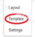


