
This is also nice tutorial for bloggers. This is about CSS3 tabs with beveled corners. You can place this gadget on sidebar.
Im using Jquery, HTML, CSS for this tutorial. Im already added 3 tabs for this
tutorial, you can add more if you want.You can check
Beautiful JQuery Multi tab Gadget For Blogger

Demo
1. Log in to blogger account and Click drop down.
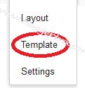
 2. Now select "Template" Like Below.
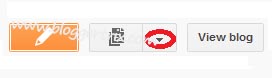
3. Now you can see Live on blog, Click EDIT HTML Button"
4. Now click Proceed button.
5. Find this tag by using Ctrl+F ]]></b:skin>
6. Paste below code Before ]]></b:skin> tag
7. Find this tag by using Ctrl+F </head>
8. Paste below code Before </head> tag
9. Go to blogger and click Layout
10. Click Add Gadget and select 'HTML/Javascript
11. Paste below code.
12. Now save your HTML/Javascript'.
You are done...
Beautiful JQuery Multi tab Gadget For Blogger

3. Now you can see Live on blog, Click EDIT HTML Button"
4. Now click Proceed button.
5. Find this tag by using Ctrl+F ]]></b:skin>
6. Paste below code Before ]]></b:skin> tag
/* The CSS Code for the menu starts here */

#tabs
{
  overflow: auto;
  width:100%;
  list-style: none;

  margin: 0;
  padding: 0;
}
#tabs li
{
    margin: 0;
    padding: 0;
    float: left;
}
#tabs a
{
    -moz-box-shadow: -4px 0 0 rgba(0, 0, 0, .2);
    -webkit-box-shadow: -4px 0 0 rgba(0, 0, 0, .2);
    box-shadow: -4px 0 0 rgba(0, 0, 0, .2);
    background: #ad1c1c;
    background:    -moz-linear-gradient(220deg, transparent 10px, #ad1c1c 10px);
    background:    -webkit-linear-gradient(220deg, transparent 10px, #ad1c1c 10px);
    background:     -ms-linear-gradient(220deg, transparent 10px, #ad1c1c 10px);
    background:      -o-linear-gradient(220deg, transparent 10px, #ad1c1c 10px);
    background:         linear-gradient(220deg, transparent 10px, #ad1c1c 10px);
    text-shadow: 0 1px 0 rgba(0,0,0,.5);
    color: #fff;
    float: left;
    font: bold 12px/35px 'Lucida sans', Arial, Helvetica;
    height: 35px;
    padding: 0 30px;
    text-decoration: none;
}
#tabs a:hover
{
    background: #c93434;
    background:    -moz-linear-gradient(220deg, transparent 10px, #c93434 10px);
    background:    -webkit-linear-gradient(220deg, transparent 10px, #c93434 10px);
    background:     -ms-linear-gradient(220deg, transparent 10px, #c93434 10px);
    background:      -o-linear-gradient(220deg, transparent 10px, #c93434 10px);
    background:         linear-gradient(220deg, transparent 10px, #c93434 10px);
}
#tabs a:focus
{
    outline: 0;
}
#tabs #current a
{
    background: #fff;
    background:    -moz-linear-gradient(220deg, transparent 10px, #fff 10px);
    background:    -webkit-linear-gradient(220deg, transparent 10px, #fff 10px);
    background:     -ms-linear-gradient(220deg, transparent 10px, #fff 10px);
    background:      -o-linear-gradient(220deg, transparent 10px, #fff 10px);
    background:         linear-gradient(220deg, transparent 10px, #fff 10px);
    text-shadow: none;
    color: #333;
}
#content
{
    border:1px solid #000000;
    background-color: #fff;
    width:200px;
    background-image: -webkit-gradient(linear, left top, left bottom, from(#fff), to(#ddd));
    background-image: -webkit-linear-gradient(top, #fff, #ddd);
    background-image:    -moz-linear-gradient(top, #fff, #ddd);
    background-image:     -ms-linear-gradient(top, #fff, #ddd);
    background-image:      -o-linear-gradient(top, #fff, #ddd);
    background-image:         linear-gradient(top, #fff, #ddd);
    -moz-border-radius: 0 2px 2px 2px;
    -webkit-border-radius: 0 2px 2px 2px;
    border-radius: 0 2px 2px 2px;
    -moz-box-shadow: 0 2px 2px #000, 0 -1px 0 #fff inset;
    -webkit-box-shadow: 0 2px 2px #000, 0 -1px 0 #fff inset;
    box-shadow: 0 2px 2px #000, 0 -1px 0 #fff inset;
    padding: 30px;
}
/* Remove the rule below if you want the content to be "organic" */
#content div
{
height: 220px; }
7. Find this tag by using Ctrl+F </head>
8. Paste below code Before </head> tag
<script type='text/javascript'>
$(document).ready(function() {
$("#content div").hide();
$("#tabs li:first").attr("id","current");
$("#content div:first").fadeIn();
$('#tabs a').click(function(e) { e.preventDefault(); $("#content div").hide(); $("#tabs li").attr("id",""); $(this).parent().attr("id","current"); $('#' + $(this).attr('title')).fadeIn(); }); })();
</script>
9. Go to blogger and click Layout
10. Click Add Gadget and select 'HTML/Javascript
11. Paste below code.
<ul id="tabs">
    <li><a href="#" title="tab1">One</a></li>
    <li><a href="#" title="tab2">Two</a></li>
    <li><a href="#" title="tab3">Three</a></li>
</ul>

<div id="content">
    <div id="tab1">One - content</div>
    <div id="tab2">Two - content</div>
    <div id="tab3">Three - content</div>
</div>
12. Now save your HTML/Javascript'.
You are done...


Nice Post . This is not spam.
ReplyDeleteRegards,
Navneet
www.techravers.com
Thank You!
ReplyDeletemy blog: http://akbalthom.blogspot.com/
Wow, I was lucky to find this site after i wanted some info on Bing! Continue the truly amazing work!
ReplyDeleteThanks you all ...
ReplyDeleteExcellent blog really like it.
ReplyDeleteThanks for sharing this idea interesting blog, Please continue this great work.
Linear Title