
In this post, im explain, how to add awesome animation button to your blog.I'm using CSS and HTML for this tutorial.You can check, demo page by below link. This is easy to add to bloggers. Earlier buttons articles
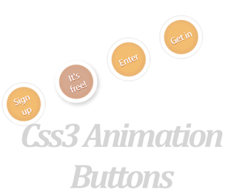
Demo
1. Log in to blogger account and Click drop down.
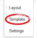
 2. Now select "Template" Like Below.
3. Now you can see Live on blog, Click EDIT HTML Button"
4. Now click Proceed button.
5.Find this code by using Ctrl+F ]]></b:skin>
6. Paste below code Before ]]></b:skin> code
7. Go to blogger and click drop-down like 1st step and select Layout
8. Click Add Gadget and select 'HTML/Javascript"
9. Paste below code.
10. Now save your template. You are done.
3. Now you can see Live on blog, Click EDIT HTML Button"
4. Now click Proceed button.
5.Find this code by using Ctrl+F ]]></b:skin>
6. Paste below code Before ]]></b:skin> code
.a-btn{
    width:60px;
    height:60px;
    -webkit-border-radius:50%;
    -moz-border-radius:50%;
    border-radius:50%;
    display:block;
    margin:20px;
    float:left;
    background:#f0ad4e;
    position:relative;
    -webkit-box-shadow:0px 0px 5px 0px rgba(246, 212, 163, 0.5) inset, 0px -1px 5px 4px rgba(170, 77, 27, 0.2) inset, 0px 0px 0px 7px #fff,  0px 0px 1px 8px rgba(188, 188, 188, 0.4), 0px 0px 0px 9px #fff;
    -moz-box-shadow:0px 0px 5px 0px rgba(246, 212, 163, 0.5) inset, 0px -1px 5px 4px rgba(170, 77, 27, 0.2) inset, 0px 0px 0px 7px #fff,  0px 0px 1px 8px rgba(188, 188, 188, 0.4), 0px 0px 0px 9px #fff;
    box-shadow:0px 0px 5px 0px rgba(246, 212, 163, 0.5) inset, 0px -1px 5px 4px rgba(170, 77, 27, 0.2) inset, 0px 0px 0px 7px #fff,  0px 0px 1px 8px rgba(188, 188, 188, 0.4), 0px 0px 0px 9px #fff;
    -webkit-transition:all 0.3s linear;
    -moz-transition:all 0.3s linear;
    -o-transition:all 0.3s linear;
    transition:all 0.3s linear;
}
.a-btn span{
    display:table-cell;
    width:40px;
    height:40px;
    padding:10px;
    text-align:center;
    vertical-align:middle;
    font-size:16px;
    color:#fff;
    text-shadow:0px 1px 1px #A03F16;
    font-family:"Arvo", "Myriad Pro", "Trebuchet MS", sans-serif;
    -webkit-transition:all 0.3s linear;
    -moz-transition:all 0.3s linear;
    -o-transition:all 0.3s linear;
    transition:all 0.3s linear;
}
.a-btn span:nth-child(1),
.a-btn span:nth-child(3){
    position:absolute;
    top:0px;
    left:0px;
    font-size:16px;
    line-height:19px;
    opacity:0;
}
.a-btn span:nth-child(1){
    background:transparent url(https://blogger.googleusercontent.com/img/b/R29vZ2xl/AVvXsEhoZx3-Cj8Q8UjZGSGzgZdyJWz9pcL3mAsT2M2wrGJkNUmGn0A0vRSSxeLhNO1-e_gaeKkUBDqNh0EyYtN_Y55J-mIP3FCs888bcMTTCHRC4E0i9YtPvPHmMynVV_Gwt6WjI89eu9MSDfY/s1600/star.png) no-repeat center center;
    opacity:0.2;
}
.a-btn:hover{
    background:rgba(170, 77, 27, 0.6);
    -webkit-box-shadow:0px 0px 5px 0px rgba(246, 212, 163, 0.5) inset, 0px -1px 5px 4px rgba(170, 77, 27, 0.2) inset, 0px 0px 0px 7px #fff,  1px 4px 5px 8px rgba(188, 188, 188, 0.6), 0px 0px 0px 9px #fff;
    -moz-box-shadow:0px 0px 5px 0px rgba(246, 212, 163, 0.5) inset, 0px -1px 5px 4px rgba(170, 77, 27, 0.2) inset, 0px 0px 0px 7px #fff,  1px 4px 5px 8px rgba(188, 188, 188, 0.6), 0px 0px 0px 9px #fff;
    box-shadow:0px 0px 5px 0px rgba(246, 212, 163, 0.5) inset, 0px -1px 5px 4px rgba(170, 77, 27, 0.2) inset, 0px 0px 0px 7px #fff,  1px 4px 5px 8px rgba(188, 188, 188, 0.6), 0px 0px 0px 9px #fff;
}
.a-btn:hover span:nth-child(3){
    opacity:1;
}
.a-btn:hover span:nth-child(2){
    opacity: 0;
    -webkit-transform: scale(0);
    -moz-transform: scale(0);
    transform: scale(0);
}
.a-btn:hover span:nth-child(1){
    -webkit-animation:rotate 1s linear;
    -moz-animation:rotate 1s linear;
    animation:rotate 1s linear;
}
.a-btn:active{
    -webkit-box-shadow:0px 0px 5px 0px rgba(246, 212, 163, 0.5) inset, 0px -1px 5px 4px rgba(170, 77, 27, 0.2) inset, 0px 0px 0px 7px #fff,  0px -1px 0px 8px rgba(188, 188, 188, 0.3), 0px 0px 0px 10px #fff;
    -moz-box-shadow:0px 0px 5px 0px rgba(246, 212, 163, 0.5) inset, 0px -1px 5px 4px rgba(170, 77, 27, 0.2) inset, 0px 0px 0px 7px #fff,  0px -1px 0px 8px rgba(188, 188, 188, 0.3), 0px 0px 0px 10px #fff;
    box-shadow:0px 0px 5px 0px rgba(246, 212, 163, 0.5) inset, 0px -1px 5px 4px rgba(170, 77, 27, 0.2) inset, 0px 0px 0px 7px #fff,  0px -1px 0px 8px rgba(188, 188, 188, 0.3), 0px 0px 0px 10px #fff;
}
.a-btn:active span:nth-child(2){
    color:rgba(170, 77, 27, 0.8);
    text-shadow:0px 1px 1px rgba(255, 255, 255, 0.6);
}
@keyframes rotate{
    0% { transform: scale(1) rotate(0);}
    50% { transform: scale(0.5) rotate(180deg);}
    100% { transform: scale(1) rotate(360deg);}
}
@-webkit-keyframes rotate{
    0% { -webkit-transform: scale(1) rotate(0);}
    50% { -webkit-transform: scale(0.5) rotate(180deg);}
    100% { -webkit-transform: scale(1) rotate(360deg);}
}
@-moz-keyframes rotate{
    0% { -moz-transform: scale(1) rotate(0);}
    50% { -moz-transform: scale(0.5) rotate(180deg);}
    100% { -moz-transform: scale(1) rotate(360deg);}
}
7. Go to blogger and click drop-down like 1st step and select Layout
8. Click Add Gadget and select 'HTML/Javascript"
9. Paste below code.
<div class="button-wrapper">

<a href="#" class="a-btn"><span></span>
<span>Sign up</span>
<span>It's free!</span></a>

<a href="#" class="a-btn"><span></span>
<span>Join Now</span>
<span>It's free!</span></a>

<a href="#" class="a-btn"><span></span>
<span>Enter</span>
<span>It's free!</span></a>

<a href="#" class="a-btn">
<span></span>
<span>Get in</span>
<span>It's free!</span></a>
</div>
*Replace Button URL10. Now save your template. You are done.


Waaw very nice. I need use with wordpress :)
ReplyDeleteThanks for button.